
.webp)
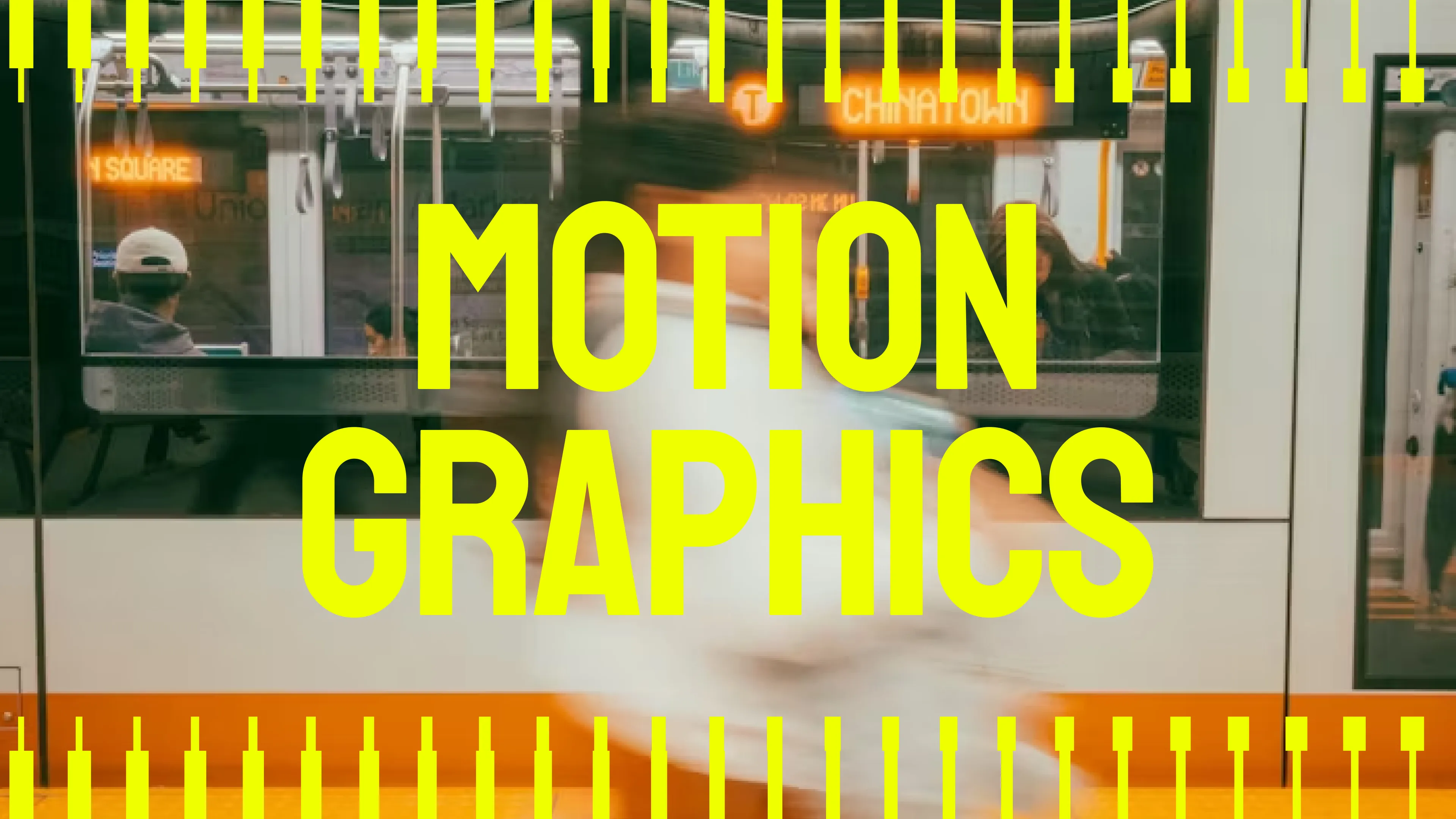
Motion Graphics: Brands Speak Through Micro-Motion

Motion Graphics: Brands Speak Through Micro-Motion
There's a moment that lasts less than a second where a product either feels alive or feels like a PDF. Most products never crack it. The ones that do become the ones people can't stop talking about.
The last app that made you smile without knowing why when you looked at it. Chances are, something moved. Not in a flashy, look-at-us kind of way, just a subtle bounce, a gentle expansion, and a little wink that said, "We thought about you when we built this." Slack's logo bounces once and somehow you trust the brand more. Airbnb's search bar expands like a map unfolding, and suddenly finding a place to stay feels like the beginning of an adventure. Duolingo's owl winks at your streak, and you feel genuinely seen by a piece of software.
That's not an accident. That's not decoration. That's a brand speaking in a language that bypasses your rational brain entirely and lands somewhere warmer and more persuasive. Motion communicates personality 47% more effectively than static design, not because designers made up a number, but because your nervous system responds to movement the way it responds to a person walking into a room. You form an impression before a single word is read.
The brands that understand this aren't using animation to show off. They're using it to say something specific about who they are, and they're saying it in a fraction of a second before you've even decided whether you're paying attention. Here's how they do it and how you can too.
Micro-interactions communicate personality, guide decisions, and trigger dopamine faster than any hero copy. Here's how top brands turn motion into their most powerful voice.
Why Motion Graphics = Brand Communication
Static design says nothing about personality. Your brain was never designed to ignore movement. For a hundred thousand years, anything that moved in your peripheral vision demanded immediate attention, because stillness was safe and motion meant something was happening. That survival instinct didn't disappear when we started staring at screens. It just started working for the brands clever enough to understand it.
Motion reveals character instantly:
- 47% higher engagement (micro-motion on CTAs)
- 3x conversion lift (guided button states vs static)
- 22x better memory encoding (moving brands stick)
- 31% longer sessions (purposeful feedback loops)
You have three seconds and a logo, a button, or an icon to communicate everything about who your brand is. The brands that win that moment aren't the ones with the biggest budgets or the most talented designers. They're the ones that understand a simple truth — in a world full of static things competing for attention, the thing that moves with intention always wins.
The 3 Motion Languages of Top Brands
1. Playful (Duolingo, Mailchimp)
- Signature: Bouncy eases, character quirks, overshoot
- Emotion: Friendly, approachable, human
- Use case: Consumer apps, creative tools
2. Elegant (Airbnb, Intercom)
- Signature: Smooth reveals, organic flow, restraint
- Emotion: Sophisticated, trustworthy, premium
- Use case: Travel, messaging, professional services
3. Industrial (Linear, Figma)
- Signature: Precise snaps, functional feedback, minimal
- Emotion: Competent, reliable, professional
- Use case: Developer tools, design software, workflows
Your brand picks one lane. Mixing languages creates trust dissonance.
Micro-Interaction Framework (5 Types + Video Case Studies)
These 5 motion types turn clicks into conversations. Each serves one clear purpose:
1. Affirmation ("You nailed it!")
Confirms success with celebratory physics.
Slack ✓ bounces (scale 0.95→1.05) = instant dopamine hit.
2. Guidance ("Try this next")
Directs attention through timing.
Airbnb search results stagger (100ms delays) = instant visual hierarchy.
3. Personality ("This is us")
Reveals character through quirks.Owl winks + dances on streaks. Result: 47% retention lift. Characters create emotional bonds.
4. Feedback ("I heard you.")
Confirms every interaction instantly.
Figma layers ripple from click origin to edge = perfect target confirmation.
5. Control ("You're the boss")
Issues snap to status columns magnetically. Result: 27% faster workflows. Motion proves user owns the tool.
Motion Implementation: 2 Rules That Work
Rule #1: 3 Motion Moments Maximum Per Screen
Every screen gets exactly three motion moments: no more, no negotiation. The first goes on your primary call-to-action, because that's the one decision you most need people to make and motion draws the eye there without asking permission. The second goes on user feedback, the instant visual response that tells someone their click registered, their form submitted, their action landed. The third is your one personality moment, the place where your brand gets to show a little character, a logo that settles with quiet confidence, a character that reacts, an element that moves in a way only your brand would move.
Everything else on the screen stays completely still. Not because stillness is easier, but because stillness is what makes those three moments matter. Contrast is what creates attention, and you can't create contrast with motion if everything is already moving.
Why: Too much motion = distraction. 3 moments communicate everything.
Rule #2: Always Respect Reduced Motion
One in eight people experience some form of motion sickness or vestibular sensitivity, meaning the animations you spent days perfecting are actively making a significant portion of your audience feel physically unwell. They won't file a complaint. They'll just quietly close the tab and not come back.
The fix is a single line of CSS that detects when a user has turned on reduced motion in their system settings and removes all transitions instantly. It takes thirty seconds to write and costs nothing. Skipping it costs you users who would have stayed for years if the screen had just held still. Good motion design isn't just about what moves; it's about knowing when to stop.
Why: 12% of users get motion sickness. One line saves your brand.
Brand Case Studies
Slack: 23% Lower Bounce, Stronger CTA Performance
Challenge: Every completed task was met with a static green checkmark that confirmed the action without celebrating it. In a productivity tool, that emotional flatness was slowly eroding the satisfaction that makes people want to return.
Action: Engineers added a single 0.2-second bounce, the icon pulling back slightly before snapping into place. A change that took less time to build than it took to approve.
Result: Primary CTAs jumped 23% in clicks. Task completion climbed. Users couldn't explain why the product suddenly felt more rewarding; they just kept coming back. One fifth of a second, repeated across millions of interactions, turned a tool people used into a tool people genuinely enjoyed.
Takeaway: Tiny affirmation motions compound across millions of interactions.
Airbnb: 31% Longer Sessions Thanks to Search Stagger
Challenge: Dumping every search result onto the screen at the same moment sounds efficient. In practice, it felt like someone was tipping a box of options onto the table and walking away. Users would glance at the pile, feel quietly overwhelmed, and make a rushed decision or no decision at all.
Action: Each result was given a 100 millisecond delay before appearing, staggered in sequence. The first result landed immediately, the second followed a tenth of a second later, and the third after that. The content didn't change. The order didn't change. Just the rhythm of how it arrived.
Result: Users explored 31% longer and completed significantly more bookings. The stagger created a natural reading flow that felt less like being handed a stack of papers and more like being walked through options at a considered pace. Motion replaced the need for visual hierarchy, extra labels, ranking indicators, and a non-cluttered UI. Just timing, doing the work that design alone couldn't.
Takeaway: Motion creates hierarchy without visual clutter.
Duolingo: Owl Reactions Drove a 47% Retention Boost
Challenge: Duolingo was functionally excellent and emotionally forgettable. Language learning is hard, repetitive, and easy to abandon, and an app that simply tracked your progress without acknowledging your humanity was giving users very little reason to come back on day two, let alone day thirty.
Action: The owl got a personality. Not through a brand refresh or a new onboarding flow, but through motion: a wink when your streak was strong, a little dance when you hit a milestone, and a visible frown when you'd been away too long. Tiny, specific reactions that made it feel less like software monitoring your behaviour and more like a character that genuinely noticed whether you showed up.
Result: Day thirty retention jumped 47%. Users didn't just stick with the app, they bonded with it, talked about it, and felt genuine guilt about letting the owl down. No copy change drove that loyalty. No feature update earned that emotional response. A few frames of animation turned a productivity tool into something that felt like a relationship, and people stayed for the relationship long after the novelty of learning a language had worn off.
Takeaway: Motion creates emotional connection faster than copy.
Motion Mistakes That Kill Brands
1. Over-Animation (Motion Sickness)
Problem: Every hover, scroll, load animates
Fix: 3 motion interactions maximum per screen
2. Decoration Masquerading as Communication
Problem: Floating particles, endless loaders
Fix: Purpose test: Does it guide, affirm, or reveal personality?
3. Ignoring Reduced Motion (Accessibility Fail)
Problem: 12% users need prefers-reduced-motion
Fix: CSS media query or instant death
4. Brand Language Mismatch
Problem: Bouncy enterprise SaaS equals immediate churn
Fix: Match motion personality to buyer psychology
Motion isn't Decoration. It’s How Modern Brands Communicate.
Every interaction your product has with a user is a conversation. Most brands are having that conversation in silence, with static buttons that say nothing, confirmations that feel like a shrug, and interfaces that work perfectly and feel like absolutely nothing. In 2026, feeling like nothing is the same as being forgettable, and being forgettable is the same as losing.
The brands people genuinely love aren't just more functional. They're more alive. A button that responds like it's glad you clicked it. A checkmark that lands with quiet confidence. An owl that notices you showed up three days in a row and tells you it. None of these moments cost much to build. All of them compound into something that static design can never manufacture — the feeling that the product was made by people who actually thought about the person on the other side of the screen.
So before you ship another update, open your top three CTAs and ask honestly: do they have a personality, or do they just have a function? Copy one bounce animation. Test it with five real users. Watch what happens when something that was silent finally has something to say.
Static design is a mute brand. Motion design is a brand that speaks, and in a world where everyone is competing for the same attention, the one that speaks with the most intention will always be the one people remember. Give your product a voice. The users who stay because of it will be the ones who stay forever.

.webp)

.svg)


