
.webp)

Why “Faster” Often Kills UX Quality

Why “Faster” Often Kills UX Quality

Most teams already move quickly, but speed without direction is exactly the problem. Research from 2025 shows a stark disconnect: while 62% of organizations using AI in design systems report reduced inconsistencies, the flip side reveals critical hidden costs that echo through the entire product lifecycle.
Common patterns show up again and again:
- Churning out screens without a clear user journey or problem statement.
- Letting AI generate polished layouts with no underlying information architecture.
- Shipping files to engineering that look good in isolation but break once real data and edge cases appear.
The result: extra rework, UX debt, and an experience that feels disjointed to users. AI doesn’t fix this by default, it amplifies whatever process you already have. If your process is weak, AI just helps you make bad decisions faster.
The right mindset is simple: AI accelerates thinking + execution, but humans own direction + judgment. The tools should help you:
- Explore more options before committing.
- Turn ideas into prototypes in hours, not days.
- Validate flows with real content and realistic behavior.
A Modern AI-Assisted UX Stack (And Where Each Tool Shines)
Think of your workflow as four layers: understanding, structure, surface, and systems. Each of your chosen tools fits a specific layer.
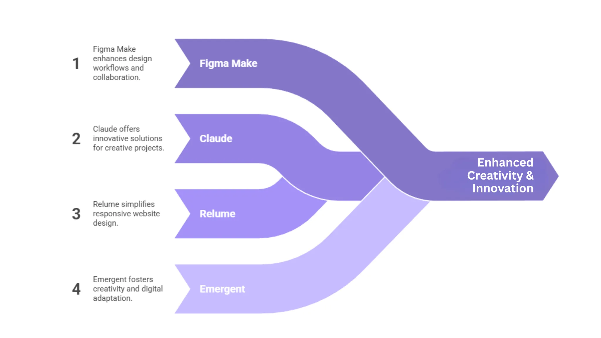
1. Claude – Understanding & UX Thinking
Claude is most powerful when treated as a thinking partner, not just a content generator.
Where it helps most:
- Turning raw stakeholder notes into clear problem definitions and UX briefs.
- Listing realistic user stories and edge cases you might overlook.
- Critiquing your flows (“Where might users hesitate?” “Which steps feel redundant?”).
- Drafting microcopy variants (onboarding, error states, confirmations) for you to refine.
Example scenario:
You paste your product requirement and rough flow into Claude and ask:
- “Summarize this into a UX brief.”
- “List 10 possible failure states or user frustrations in this flow.”
- “Suggest ways to reduce cognitive load in step 3.”
You still decide what to keep, but Claude helps you see blind spots faster and articulate UX decisions clearly.
Use Claude when: you’re framing problems, exploring scenarios, or stress-testing flows before you invest heavily in design.
2. Relume – Structure, IA, and Early Alignment
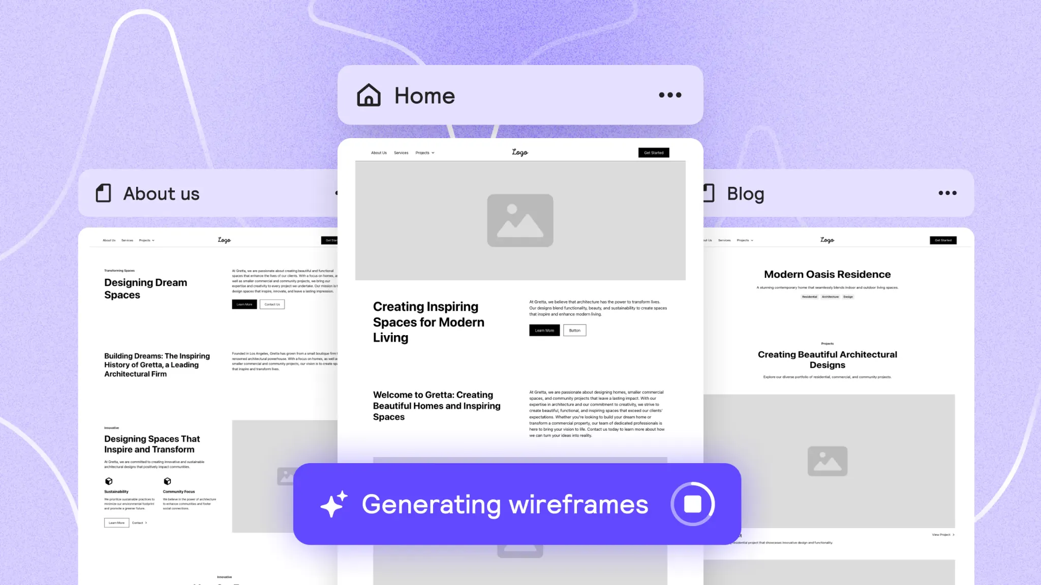
Relume is incredibly strong in the early phases of web and product marketing UX, especially for SaaS and product-led companies that live and die by their website and landing experiences.
What Relume is great for:
- Generating sitemaps and wireframes from prompts in minutes.
- Running live workshops where you co-create page structures with stakeholders.
- Quickly scaffolding marketing sites, documentation, or resource hubs using solid UX patterns.
- Exporting those wireframes into Figma, where your design system takes over.
Teams using Relume commonly report cutting the IA (Intelligence Automation) + low-fidelity phase from days to hours and getting stakeholder buy-in much earlier because people can react to real structures instead of vague slides.
The key is knowing its role: Relume is there to accelerate structure, not to define your final visual language. Once wireframes are in Figma, your brand, content strategy, and interaction patterns should take over.
Use Relume when: you’re mapping flows and page structures, especially for websites, dashboards, and documentation that need clear hierarchy and fast stakeholder alignment.
3. Figma Make – From Flows to Testable Screens
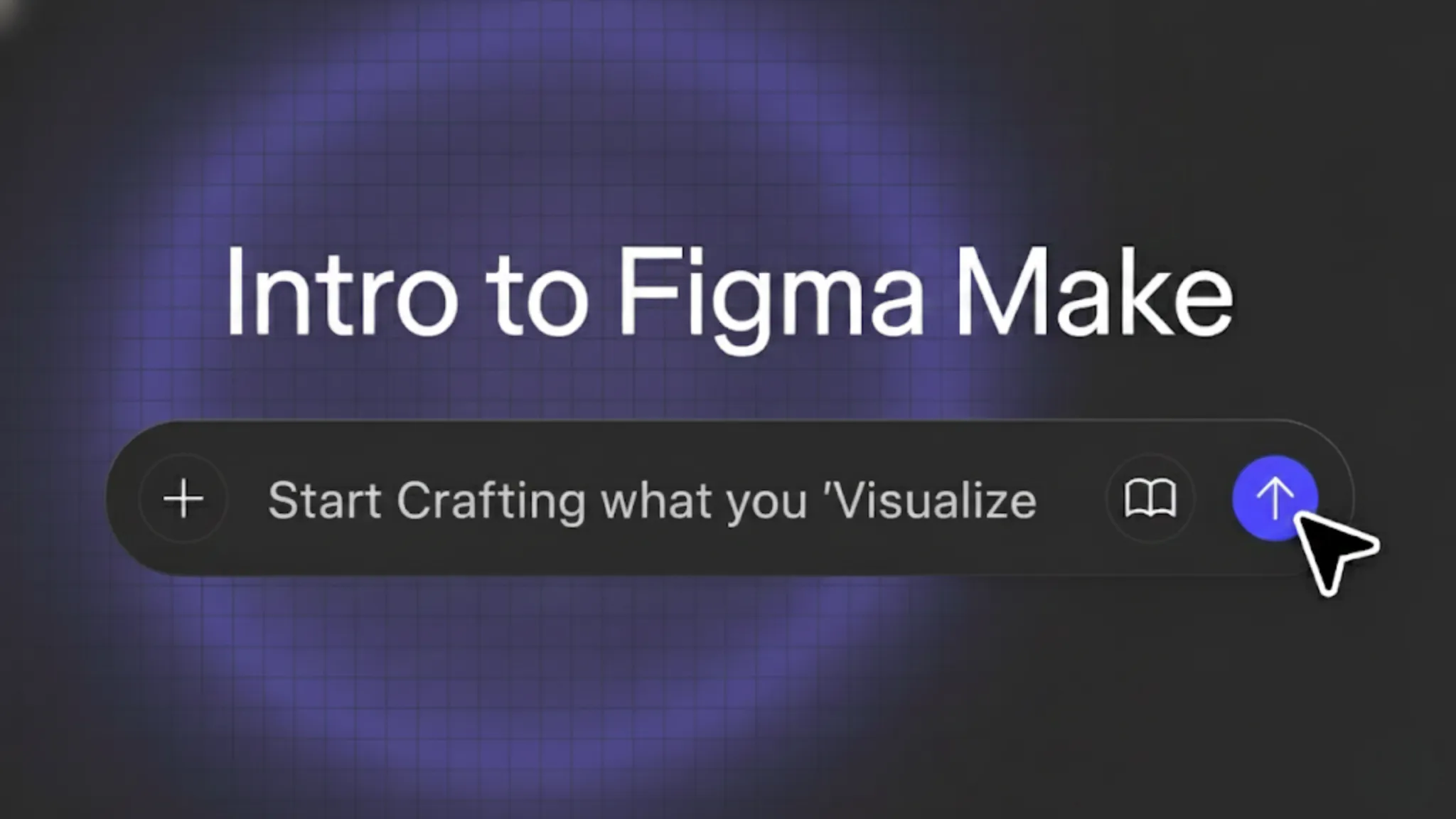
Figma’s AI capabilities (often referred to as Figma’s AI/Make features) turn natural language and rough flows into screen layouts directly inside your existing design environment.
Where it excels:
- Turning a described flow (“User signs up → confirms email → sets preferences → lands in dashboard”) into a first-pass set of screens.
- Quickly iterating on layout and hierarchy with prompts (“make this form less overwhelming,” “improve scannability,” “group related actions together”).
- Helping designers generate multiple layout variants for comparison.
- Keeping everything in one place so your design system, tokens, and components stay central.
A practical way to use it:
- Start by writing the flow in plain language (after you’ve validated it with Claude).
- Use Figma AI to generate a first version of the screens.
- Immediately refactor: snap to your grid, apply your real components, enforce typography and spacing.
- Use prompts only for structural changes, never as a replacement for your design system.
This keeps you from shipping “AI-flavored” interfaces and instead uses AI as a fast layout engine that respects your existing UX patterns.
Use Figma Make when: you’re past the “what are we building?” phase and entering “how should this look and behave on-screen?” especially when you want many options quickly and still stay inside your design system.
4. Emergent – From UI to Working Product
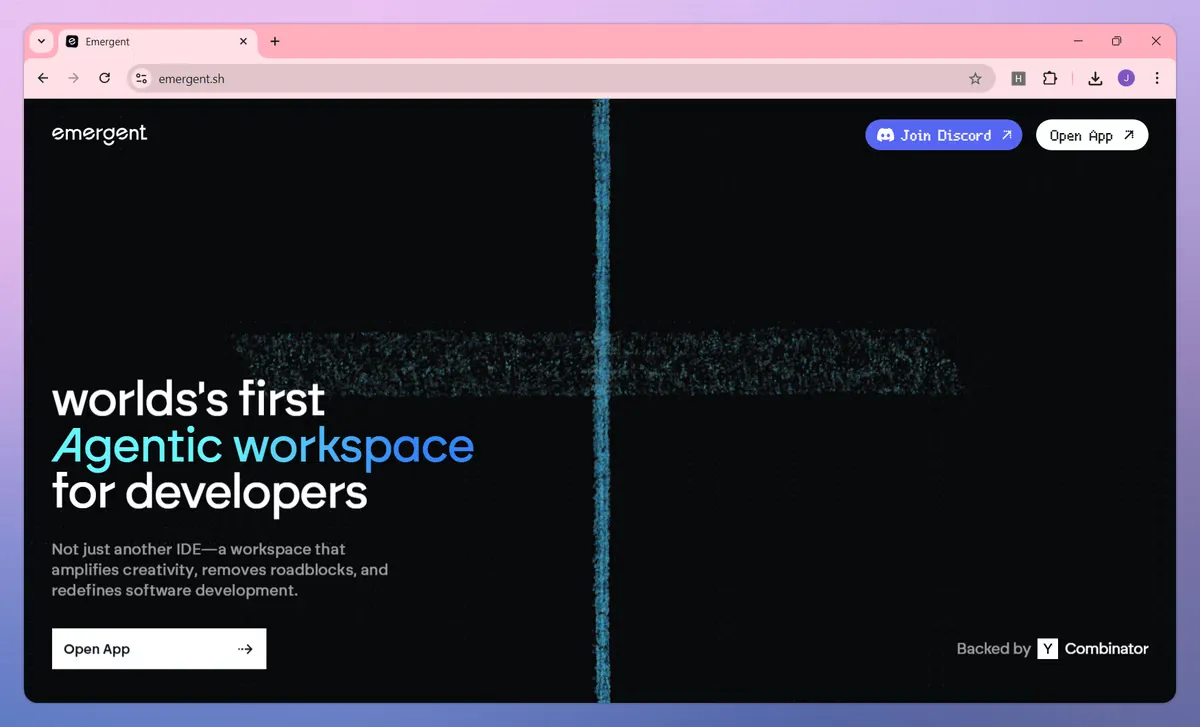
Emergent sits closer to the “design-to-production” end of the spectrum. It’s designed to go beyond static mockups and generate interfaces, logic, and even full apps from conversational prompts.
Where it’s especially useful:
- Generating high-fidelity UI with sensible layout, responsiveness, and component structure.
- Prototyping dashboards, admin tools, and complex flows that need real data interactions.
- Producing front-end behavior and scaffolding that engineering can build on instead of rewriting.
- Experimenting with new product ideas end-to-end: from rough concept → working prototype.
Imagine needing a new reporting dashboard for enterprise customers. With Emergent, you can describe your entities, key metrics, and interactions, then get a fully responsive UI and behavior that’s close enough to test with real users.
Use Emergent when: you want to validate flows as functioning software, not just clickable prototypes, especially for complex SaaS experiences where the integration between UX and data is critical.
A Concrete AI-Assisted Workflow (End-to-End)
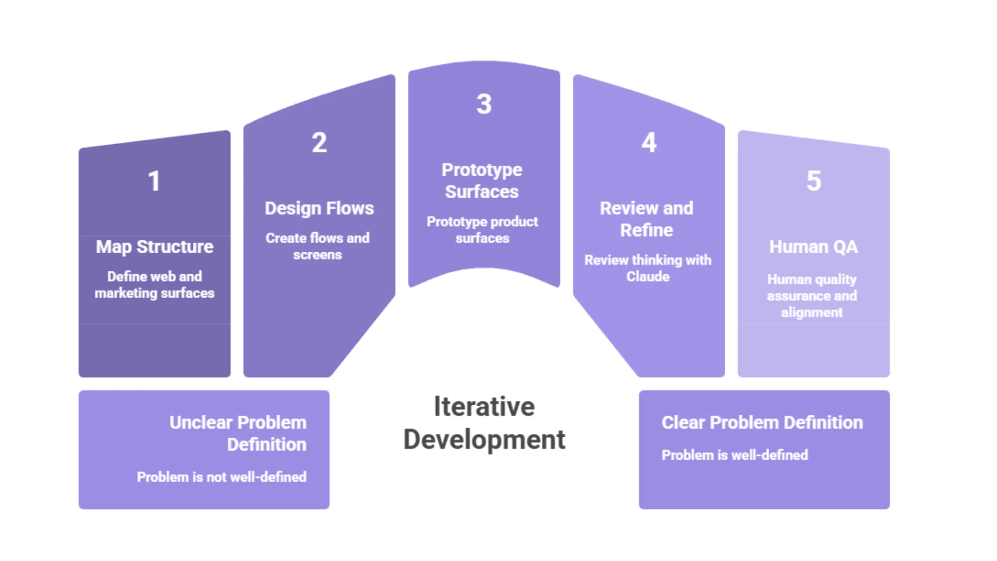
To show how all four tools complement each other, here’s a realistic workflow for a B2B SaaS feature—from idea to near-production:
- Clarify the problem with Claude
- Feed it stakeholder notes, support tickets, and your own understanding.
- Ask for: a UX brief, user stories, and likely edge cases.
- Use that to define success criteria and constraints.
- Feed it stakeholder notes, support tickets, and your own understanding.
- Map structure with Relume (for web and marketing surfaces)
- Prompt Relume to generate a sitemap and key page sections.
- Refine structure live with stakeholders, so you reduce misalignment later.
- Export wireframes into Figma once the structure is agreed.
- Prompt Relume to generate a sitemap and key page sections.
- Design flows and screens with Figma Make
- Turn validated flows into screens using AI prompts.
- Iterate quickly on layout and hierarchy.
- Snap everything to your design system and components once direction is chosen.
- Turn validated flows into screens using AI prompts.
- Prototype product surfaces with Emergent
- Describe the dashboard, configuration panel, or multi-step process.
- Let Emergent generate a working, responsive UI with baseline logic.
- Refine interactions and visual details to match your system.
- Describe the dashboard, configuration panel, or multi-step process.
- Review and refine thinking with Claude
- Paste key flows and screens back into Claude for critique.
- Ask it to identify friction points or suggest clearer UX copy.
- Use its feedback as input for another round in Figma/Emergent.
- Paste key flows and screens back into Claude for critique.
- Human QA and alignment
- Run through accessibility checks, responsiveness, and edge cases manually.
- Validate against your UX principles and brand voice.
- Test with real or representative users before committing.
- Run through accessibility checks, responsiveness, and edge cases manually.
You get speed at every step, but every decision is still anchored in product goals, UX principles, and human judgment.
Guardrails So You Don’t Sacrifice Quality
AI is powerful enough now that you need guardrails as much as you need tools. Some practical ones:
- Design system first, AI second
Put in the work to define tokens, components, spacing rules, and patterns. Feed those into your AI-assisted tools so they generate on-system by default, instead of inventing new patterns every time. - No AI output goes straight to production
Always pass through human QA—ideally a designer plus at least one engineer and one PM. If something looks “magically done,” assume it needs extra scrutiny. - Bias toward simplifying, not beautifying
Use AI to reduce cognitive load, cut steps, and clarify content—not just to add visual flair. Ask prompts like “How can this screen be simpler?” rather than “Make this more impressive.” - Document decisions, not just screens
Use Claude to summarize rationale: why this layout, why this interaction, why this copy. Future you (and future teammates) will preserve quality because they’ll understand the intent behind the interface. - Keep talking to real users
AI can simulate scenarios, but it can’t replace real user feedback. Use it to generate hypotheses; validate those hypotheses with actual people.
How to Position These Tools in Your Own Strategy
If this blog is aimed at B2B product, UX, or design leaders, here’s the narrative that tends to resonate most:
- Figma Make – Your central engine for AI-assisted UX exploration and refinement inside your existing design environment. It’s where flows become real screens fast, still controlled by your design system.
- Claude – Your always-on UX strategist and copy partner. It turns chaos into clarity and pushes your thinking, but never replaces your judgment.
- Relume – Your IA and wireframe accelerator for web and marketing experiences. It ensures structure is right and stakeholders are aligned long before you start polishing pixels.
- Emergent – Your bridge from design to working product, especially useful for dashboards, admin tools, and dynamic SaaS workflows.
Used together, they don’t replace designers; they remove the slowest, most repetitive parts of the job so designers can spend more time on the things only humans can do: understanding users, making trade-offs, and crafting experiences that feel distinctly “you,” not “AI.”
Conclusion: Speed as a Byproduct of Better Process
AI-assisted UX/UI design isn’t about cutting corners. It’s about removing the busywork between intent and validation. When you plug AI tools into a solid UX process; rather than replacing the process, you get both speed and quality as natural outcomes.
The next step for any product or design team is simple:
- Audit your current workflow and identify where time is wasted (requirements, IA, layouts, prototypes, or handoff).
- Map each pain point to one of these tools: Claude, Relume, Figma Make, Emergent: based on its strengths.
- Introduce AI one layer at a time, with clear guardrails and human review.
Do that, and you won’t just “design faster with AI.” You’ll design better with AI quietly handling the heavy lifting in the background while your team stays fully focused on the one thing no model can automate: meaningful, user-centered decisions.


.svg)


