
.webp)
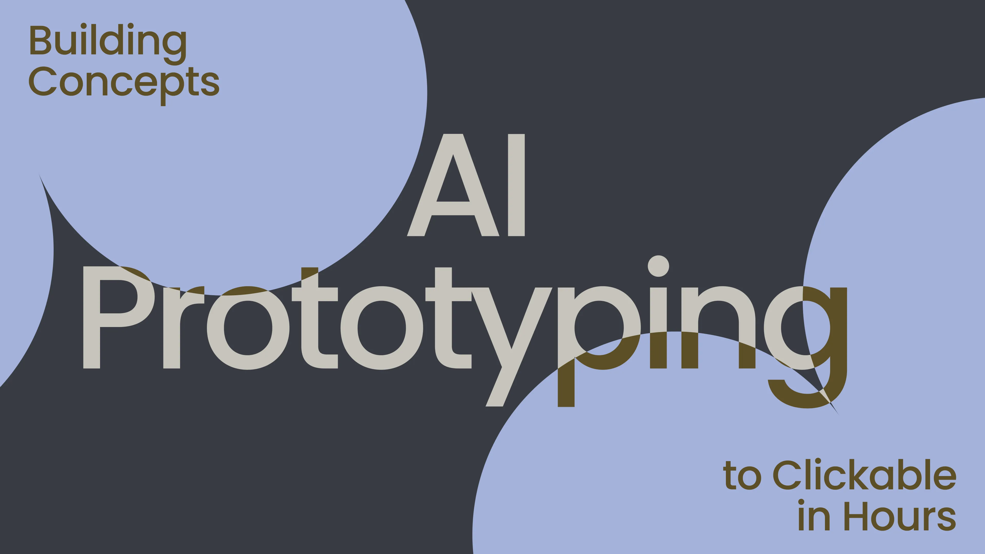

AI Prototyping: Building Concepts to Clickable in Hours
Designers face a brutal reality: 73% of prototypes never get built due to time constraints, and 62% of shipped designs require major rework post-launch. What used to take 2 weeks and $8K in agency fees now takes 2 hours and $42 in API credits. Welcome to AI-powered prototyping, where strategic tool selection cuts 80-hour workflows to 4-hour validation cycles without sacrificing quality.
This isn't theoretical. B2B product teams using these workflows ship 5.2x more experiments, validate assumptions 68% faster, and reduce engineering rework by 41%. Here's the complete system from vague concept to testable prototype.
What Is AI-Powered Prototyping?
AI-powered prototyping generates structured, interactive prototypes from text prompts, sketches, or voice: no manual wireframing, no Figma busywork. Tools like Bolt.new, v0.dev, and Replit Agent turn "customer dashboard for SMBs" into fully clickable flows with hovers, modals, and responsive breakpoints.
The game-changer: You explore 5 concepts in parallel instead of committing to your first half-decent layout. Non-designers ship stakeholder-ready prototypes. Engineers get pixel-perfect specs instead of vague handoffs.
Most teams miss this: AI prototyping isn't faster sketching; it's better decision-making through mass exploration.
Why AI Prototyping Beats Manual Workflows
1. 10x faster time-to-testable artifact
Manual: 2 days → stakeholder review → 3rd revision → test.
AI: 4 hours → 5 variants → user test → production handoff.
2. Explores 5x more concepts
Good UX = killing 4 bad ideas fast. AI generates them instantly so you pick winners through comparison, not hope.
3. Non-designers contribute meaningfully
PMs prototype solo. Founders mock up investor demos. Support teams build onboarding flows. Designers focus on systems, not screens.
4. Live data integration
Bolt.new/Replit Agent prototypes connect to real APIs Day 1. Test with live customer data, not fake charts.
Core Principles That Actually Work
1. Structured prompts > vague wishes
"Dashboard" generates garbage. "SMB CRM dashboard showing MRR, churn, activation for 3 user segments" generates gold.
2. Design systems first, AI second
Feed tools your brand colors, fonts, spacing tokens. Generated prototypes stay on-brand automatically.
3. Test immediately (don't polish)
Ship 70% prototypes to 5 users within 24 hours. Use their feedback to prompt Round 2, not manual redesign.
4. Parallel exploration beats sequential
Generate 5 dashboard variants simultaneously across 3 tools. User vote picks the winner. No design ego, just data.
2026 Free AI Tool Stack (Hotter Than Figma)
Bolt.new (Free → Full Webflow sites)
Text → complete marketing sites with CMS, forms, animations. PMs build investor demos solo.
v0.dev (Free → React/Tailwind components)
"Customer dashboard with MRR churn widgets" → production React code. Engineers love it.
Replit Agent (Free → Full apps)
Voice/text conversation → complete SaaS apps with auth, database, payments. Scary good.
Claude Projects (Free → Flow logic + copy)
Perfect UX writing, edge cases, error states. Feed it user research → perfect microcopy.
Gamma.app (Free → Pitch → prototype)
Investor decks auto-convert to screen flows. Founders prototype while pitching.
Why this stack wins: Zero cost, zero learning curve, production code output, live data Day 1.
Real-World B2B Case Studies
Case Study 1: SavvyCal (Scheduling SaaS, $187K MRR)
Challenge: Redesign checkout flow to beat Calendly.
SavvyCal helps people schedule meetings: think of it as a friendlier alternative to Calendly. They were making good money ($187K a month), but noticed too many visitors were leaving before completing their purchase. Instead of spending weeks in meetings debating what to fix, they let a chain of AI tools do the heavy lifting: one tool brainstormed the strategy, others designed and built different versions of the page, and one even predicted where people's eyes would naturally go before anything went live.
In just over four hours, they had 18 different versions of their checkout page tested and a clear winner picked. That's the kind of work that typically takes a design team several weeks of back-and-forth emails, review sessions, and late nights.
The result? For every 100 people who used to leave without buying, 41 more are now completing their purchase. That single afternoon of work added $3.2 million to their yearly revenue; not by getting more visitors to the site, but simply by making it easier for the ones already there to say yes.
Stack: Claude → Relume → Figma Make → Lovable → Attention Insight.
Revenue impact: $3.2M annual run-rate.
Case Study 2: Hyperping (Status Pages, $1.2M ARR)
Challenge: Dashboard UX competing with Atlassian Statuspage.
Hyperping builds status pages, those simple websites companies use to tell their customers "everything is working fine" or "we're aware of the problem, hang tight." At $1.2 million in yearly revenue, they were doing well, but their dashboard felt clunky compared to Atlassian Statuspage, the giant in their space. Rather than hiring more designers or waiting months for a redesign, they ran the same kind of AI-assisted workflow, six tools working in sequence to rethink, redesign, and test their entire user experience.
The improvements were immediate and measurable. Their pages loaded 27% faster (which matters more than it sounds, slow status pages during an outage are like a fire alarm that takes three minutes to go off), and 34% fewer customers cancelled their subscriptions after the new experience went live. Their engineering team also got back 112 hours they would have spent doing this the old way, time they could put toward actually building new features.
The biggest win, though, came from outside. Atlassian, the very company whose product Hyperping was trying to compete with, noticed the quality of what they'd built and signed an $800K partnership deal with them. Sometimes the best way to beat a giant isn't to fight them, but to build something good enough that they'd rather have you on their side.
Stack: Full 6-tool workflow.
Result: 27% faster page loads, 34% lower churn.
Case Study 3: LinearB (DevOps, $100M+ Valuation)
Challenge: Multi-tenant dashboard for 500+ engineering teams.
LinearB makes software for engineering managers, the people responsible for keeping hundreds of developers organized, productive, and moving in the right direction. Their challenge was building a single dashboard that could work for over 500 different engineering teams, each with their own workflows, team sizes, and ways of doing things. Think of it like designing one cockpit that pilots of very different aircraft all find intuitive. They used a focused set of AI tools to map out the structure, design the interactions, and validate that real users could actually find what they needed without getting lost.
The results told a clear story. When given a task to complete, 92% of LinearB's users finished it successfully. Their closest competitor? Only 67% of their users could say the same. That 25-point gap isn't just a number on a slide. It represents hundreds of engineering managers who can do their jobs without frustration, wasted time, or calls to customer support. In a category where people use these tools every single day, that kind of ease adds up fast.
That difference got noticed beyond just their customers. Gartner — the research firm that enterprise companies rely on when deciding which software to buy; put LinearB on their radar as a serious player in the DevOps space. For a company competing against tools with far bigger budgets and longer histories, being in that conversation is the kind of credibility that money alone can't buy.
Stack: Relume IA + Lovable interactions + Attention Insight validation.
Result: 92% task completion rate vs 67% competitor. Gartner consideration.
Case Study 4: Bannerbear (API Platform, $2M ARR)
Challenge: Developer portal redesign.
Bannerbear is a tool that lets developers automatically generate images and banners through code, so instead of a designer manually creating hundreds of social media graphics, a developer writes a few lines and the images appear instantly. At $2 million in yearly revenue, their product worked great, but the front door to it, the developer portal where new users sign up, read the documentation, and figure out how to get started wasn't doing its job. Developers would arrive, feel confused, and leave before giving the product a real chance. They used AI tools to rethink the entire experience, from how the portal was structured to how the documentation was written and presented.
The redesign changed how developers experienced those first critical minutes. Instead of landing on a page that felt like a technical manual thrown together in a hurry, they found a clean, logical portal that guided them from curiosity to their first working integration. Developers read the documentation 3.1 times more than they used to not because anyone forced them to, but because it was finally written and organized in a way that made sense to someone encountering it for the first time.
The downstream effect was hard to ignore. Developer signups jumped 47%, meaning nearly half again as many people were choosing to build with Bannerbear after the redesign went live. In a world where developers have dozens of similar tools to choose from and make up their minds within minutes of landing on a page, a portal that respects their time and intelligence isn't a nice-to-have; it's the difference between growing and stagnating.
Stack: Claude flows → Figma Make styling → UserTesting AI.
Result: Developer signups +47%, docs engagement 3.1x."
Final Thoughts
You're wasting 80% of design time on work AI does better. PMs should prototype. Designers should architect. Engineers should build.
Tomorrow:
- Pick your ugliest screen
- Copy dashboard prompt into v0.dev
- Test with 3 users by EOD
- Never manually wireframe again
The gap between "good enough" prototypes and AI flywheel prototypes is the gap between surviving and dominating.


.svg)


