5 min readMINUTES
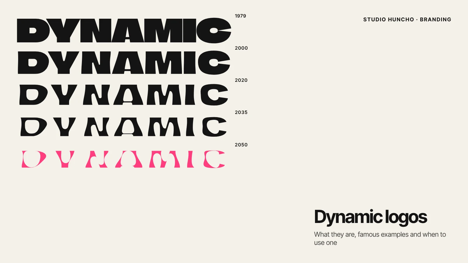
Dynamic Logos: What They Are, Famous Examples and When to Use One

The short answer
A dynamic logo is a logo designed to change while staying recognisable. It might change its colour, shape, content or motion depending on where it appears or what it needs to say. Well-known examples include Google's Doodles and animated dots, the MIT Media Lab's family of related glyphs and the Whitney Museum's responsive W. A dynamic logo suits tech brands whose product is itself flexible, generative or interactive, but it needs a fixed core and clear rules to work.
What is a dynamic logo?
A traditional logo is one fixed mark used the same way everywhere. A dynamic logo is a system: a constant element that people learn to recognise, plus variables that change. The constant might be a shape, the letterforms, a grid or a colour sequence. The variables might be imagery, layout, motion or data.
The term covers a few related ideas:
- Responsive logos change their level of detail to suit the space, from a full wordmark down to a small symbol.
- Generative logos are produced by rules or code, so there can be many versions.
- Content-driven logos keep a fixed frame and change what sits inside or behind it.
- State-driven logos move or change to show what is happening, such as listening, loading or thinking.
Famous dynamic logo examples
Google has changed its logo for events since its first Doodle in 1998, a note that the founders were away at Burning Man. Google says it has made more than 5,000 Doodles. Its 2015 identity added a more systematic kind of flexibility. Google's design team describes three parts: the full logotype, a compact G for small contexts and the Dots, "a dynamic distillation of the logotype for interactive, assistive, and transitional moments", which animate to show states such as listening, thinking and replying.
MIT Media Lab
In 2014, Michael Bierut and Aron Fay of Pentagram built the Media Lab's identity on a seven-by-seven grid taken from an earlier identity by Richard The. The grid produces an ML monogram and a related glyph for each of the Lab's 23 research groups. That earlier identity, by Richard The with Roon Kang, could generate more than 40,000 permutations.
Whitney Museum of American Art
In 2013, Experimental Jetset designed a new mark for the Whitney: a simple, dynamic W that, in the museum's own words, "responds to the artworks and words around it".
AOL
In 2009, Wolff Olins created an identity for AOL in which the logo stayed constant while the image behind it changed, from a fish to a skateboarder to a high-heeled shoe. Marketing Week reported that the idea was to reflect the variety of content AOL offered.
Casa da Música
For the Casa da Música concert hall, Stefan Sagmeister's team turned the building's distinctive shape into a logo that changes character from application to application, showing "different views and facets of music".
Fugue
A software example: in 2015, Sagmeister & Walsh designed an animated identity for Fugue, a company whose system automated the running of cloud infrastructure. Dezeen reported that the logo's lines and dots constantly regenerate, echoing how the software works, and can move in time with music.
Responsive logos: the minimum every tech brand needs
Even if you don't want a fully dynamic identity, you need a responsive set. When Pentagram updated Slack's identity, it designed the hashtag mark so it could scale up or down for legibility at different sizes. Google's G exists for the same reason. At a minimum, plan:
- A full logo for the website header, decks and documents
- A compact symbol or monogram for the app icon and social avatars
- A simplified favicon that reads at 16 pixels
- One-colour and reversed versions of each
When a dynamic logo suits a tech brand
- Your product is generative, adaptive or personalised. AI products, data platforms and creative tools can show what they do through a logo that changes.
- You have a voice or agent interface. Like Google's Dots, an animated mark can show states such as listening or thinking inside the product.
- You have many sub-brands or teams. A shared grid, as at the MIT Media Lab, can give each one its own mark while keeping a family look.
- Your content is the product. Like AOL, a fixed frame with changing content can show range.
When to keep it simple
- You're early and recognition is close to zero. A fixed mark builds memory faster.
- You don't have the design or engineering time to maintain a generative system.
- You sell into conservative categories where consistency signals safety.
How to design a dynamic logo that still works
- Fix one thing. Decide what never changes: the shape, the letterforms, the grid or the colour order.
- Define the variables. List exactly what can change and why. Change should carry meaning, not happen at random.
- Design a static default. Invoices, legal documents, app stores and partner pages need one fixed version.
- Test small first. Check the favicon, app icon and social avatar before anything else.
- Document the rules. Put the system, the variables and examples in your guidelines, with code or templates if it's generative.
- Plan the motion. If it animates, set timing and easing so it feels like one brand across product and video.
Motion is usually where a dynamic identity comes to life. Through our Motion Design & Video work, such as our ongoing partnership with Pine Labs on announcement films and event motion, we've seen how much clear motion rules help one brand stay consistent across very different outputs.
FAQ
What's the difference between a dynamic logo and a responsive logo?
A responsive logo changes its detail to fit the space, such as a full wordmark on a website and a symbol in a browser tab. A dynamic logo changes for other reasons too: content, data, events or interaction. Most dynamic identities include a responsive set.
Is an animated logo a dynamic logo?
Not always. A logo with one fixed animation is a motion logo. It becomes dynamic when its form or movement changes with context or state.
Do dynamic logos hurt recognition?
They can if nothing stays fixed. The examples that work, such as Google and the MIT Media Lab, keep a strong constant: a colour sequence, a grid or a letterform.
Can a startup have a dynamic logo?
Yes, if the system is simple: a fixed symbol with a few defined variations or motion states. Start simple and add variation once people know the mark.
Thinking about a logo that moves with your product? Tell us what you're building and we'll help you decide how far to take it. You can also see our Branding & Brand Identity Design service.
Work with Studio Huncho
We're a creative studio for AI and SaaS startups. We design brands, websites, products and launch films, and build sites in Webflow and Framer.