5 min readMINUTES
SaaS Landing Page Design: Anatomy of a Page That Converts

The short answer
Good SaaS landing page design does one job for one audience. A high-converting page has a headline that says what you do and for whom, one primary call to action, a real product visual, proof near the top, a few benefit sections, answers to the main objections (pricing, security, integrations), an FAQ and a closing CTA. Unbounce's benchmark data puts the median SaaS landing page conversion rate at 3.8%, so small improvements in clarity add up quickly.
Landing page vs homepage
A homepage serves everyone: buyers, candidates, investors, existing users. A landing page serves one group arriving from one source, such as a paid search ad, a launch post or an outbound email, and asks them to do one thing. That's why landing pages can be shorter, more specific and stricter about distractions.
If the page receives ad traffic, keep the promise of the ad. Landing page experience is one of the three parts of Google Ads Quality Score, defined as how relevant and useful your landing page is to people who click your ad.
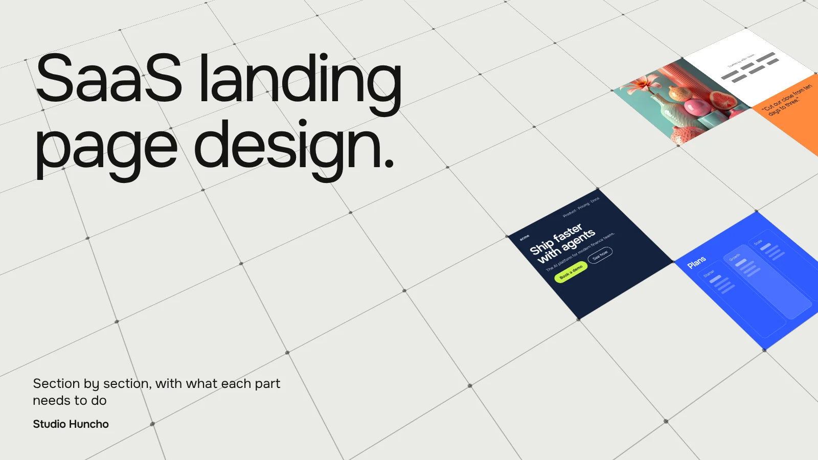
The anatomy of a SaaS landing page design, section by section
1. Headline and subhead
Name the outcome and the audience in under ten words, then use the subhead to explain how. Stripe's "Financial infrastructure to grow your revenue" is a good benchmark: specific category, clear outcome. Avoid clever lines that need the rest of the page to make sense.
2. One primary CTA
Pick the action that matters, such as "Start free" or "Book a demo", and repeat it down the page. A softer secondary option is fine for people not ready yet. Notion pairs "Get Notion free" with "Request a demo"; the free option is the primary button.
3. A real product visual
Show the product doing the thing the headline promises. A short looping clip or an annotated screenshot works better than an abstract illustration. Linear's homepage opens on its product interface with live-looking activity, which explains the product before any copy does. A short product video can do the same job; see what makes a good SaaS launch film.
4. Proof bar
Directly under the hero, add logos of recognisable customers or one or two numbers. Linear's pricing page states it is "Trusted by more than 40,000 companies". If you are early, a strong quote from a named customer or a notable investor is better than an empty logo strip.
5. The problem, in the buyer's words
One short section that describes the pain the visitor already feels. Keep it concrete: the spreadsheet, the manual step, the missed renewal. Attio's homepage does this in a line: "Picks up leads at 2am. Catches renewals before they slip."
6. Three or four benefit sections
Each section pairs a benefit headline with a product visual and two or three lines of copy. Lead with the outcome and then the feature that delivers it. Three strong sections beat eight weak ones.
7. How it works
Three steps from sign-up to first value: connect, configure, see results. This lowers the perceived effort of getting started.
8. Integrations
Show the tools the product connects to, with the most relevant ones for this audience first. For many SaaS buyers, "does it work with our stack?" is the first real question.
9. A customer story with numbers
One focused story beats a carousel. Use a named person, their role, their company and a result. Linear titles its stories by outcome, such as "How Scale compressed bug resolution time by 52%".
10. Pricing context
On a landing page you don't need the full pricing table, but answer "roughly what does this cost and how is it charged?" A line about the plan structure or a free tier, with a link to the pricing page, removes a common reason to leave.
11. Security and compliance strip
For B2B buyers, a row of certifications with a link to the security page answers IT's first question. Linear's security page, for example, lists SOC 2 Type II and ISO 27001 with links to request reports.
12. FAQ
Four to six real objections from sales calls: setup time, data migration, contract length, support, pricing changes. Short answers, plain text.
13. Closing CTA
Restate the outcome in one line and repeat the primary button. Visitors who scrolled this far are interested; don't make them scroll back up.
Copy and layout rules
- Write for scanners. Nielsen Norman Group found that users read at most 28% of the words on an average page visit, and 20% is more likely. Headlines and button labels carry the page.
- Use plain language. Unbounce's SaaS benchmark data found that pages written at a 5th to 7th grade reading level converted far better than pages written at a professional level.
- Cut the navigation down on paid landing pages so the main CTA is the obvious next step.
- Design mobile first. Check the hero, CTA and form on a phone before desktop.
- Keep forms short. Ask only what you need to route the lead.
- Make buttons readable. WCAG level AA asks for at least 4.5:1 contrast for normal text, and button labels count.
- Keep it fast. Aim for a Largest Contentful Paint within 2.5 seconds. Compress hero videos and images, and limit third-party scripts.
A landing page checklist
- One audience, one source, one primary action.
- Headline names the outcome and the audience.
- Product visual in the first screen.
- Proof directly under the hero.
- Three or four benefit sections, each with a visual.
- Integrations, pricing context and security covered.
- FAQ built from real sales objections.
- Closing CTA that repeats the primary action.
- Tested on mobile and loading fast.
We design landing pages alongside the launch itself. For Breakout, an inbound AI SDR, we did the website, product design and launch film together. For Further AI, we did the brand, website, motion and Webflow build in the pre-raise window before its $25M Series A from a16z.
FAQ
How long should a SaaS landing page be?
As long as it takes to answer the main objections and no longer. A focused page with the 13 sections above, each kept short, is usually enough.
Should a SaaS landing page have navigation?
For paid traffic, keep navigation minimal so the main action stands out. For organic landing pages, a light header helps visitors explore.
What is a good conversion rate for a SaaS landing page?
Unbounce's benchmark puts the SaaS median at 3.8%. Compare against your own past pages rather than a single industry number.
Video or static image in the hero?
A short, silent, looping product clip often explains more than a static shot. Keep it compressed so it doesn't slow the page.
Launching something soon? Tell us what you're shipping. We design landing pages through Website, Product & App Design and make the product videos for them through Motion Design & Video.
Work with Studio Huncho
We're a creative studio for AI and SaaS startups. We design brands, websites, products and launch films, and build sites in Webflow and Framer.