2 min readMINUTES
What Makes a Good SaaS Pricing Page?

The short answer
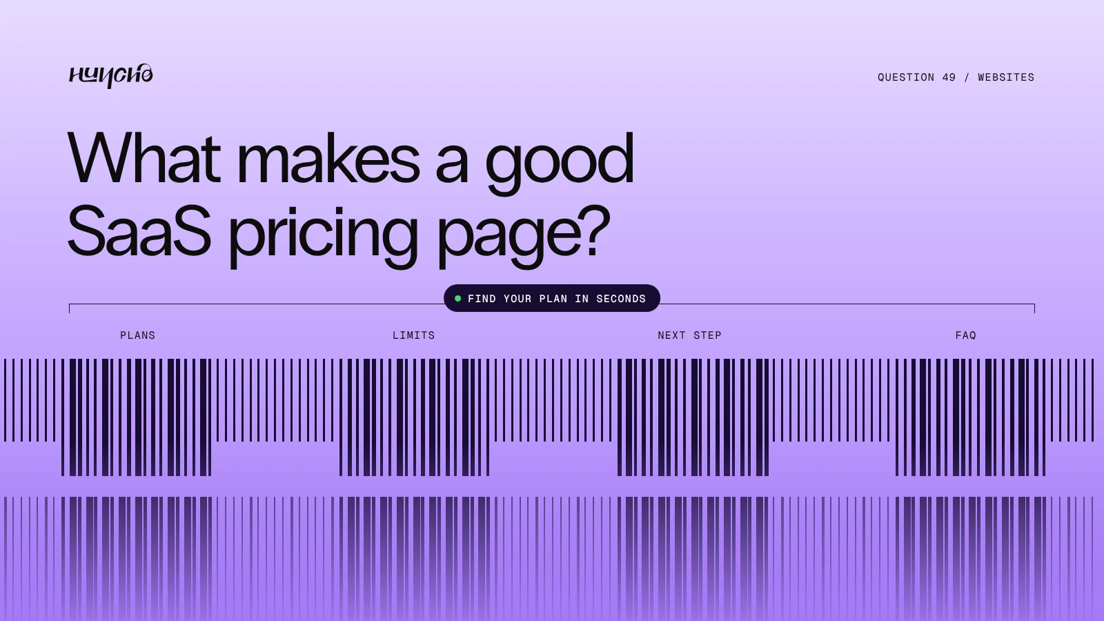
A good pricing page lets a buyer find their plan in seconds. It shows three or four plans, what each includes, who each is for, and one clear next step. Long feature grids and unexplained terms lose buyers.
A pricing page at a glance
- Plans: Three or four, named by who they are for
- Shown first: Price, billing period and the main limits
- Next step: One button per plan
- Below the plans: Feature comparison, FAQ and security notes
What to include
- A recommended plan. Highlight one.
- Plain limits. Seats, usage and what happens when you go over.
- Monthly and annual options. With the saving shown.
- An enterprise route. A contact option for custom needs.
- Proof. Customer logos or a short quote near the buttons.
- FAQ. Billing, cancellation and trials.
If you cannot publish prices
Say what decides the price and show what each tier includes. A bare "Contact us" tells the buyer nothing.
Studio Huncho designs pricing pages as part of full SaaS websites. See SaaS website design.
Related reading: SaaS Website Design: 12 Best Practices (2026), What Should Be on a B2B SaaS Homepage?, Best Website Design Agencies for SaaS Startups (2026)
FAQ
Should a SaaS startup show prices?
If you sell self-serve, yes. If every deal is custom, explain what drives the price.
How many plans is too many?
More than four makes the choice harder.
Where should the pricing link go?
In the main navigation. Buyers look for it early.
Redesigning your site? Tell us about it.
Work with Studio Huncho
We're a creative studio for AI and SaaS startups. We design brands, websites, products and launch videos, and build sites in Webflow and Framer.