10 min readMINUTES
Best SaaS Websites: 25 SaaS Website Examples Worth Studying (2026)

The short answer
The best SaaS websites in 2026 make one clear promise in about six words, show the real product on the first screen and offer two ways forward: start free or talk to sales. Below are 25 SaaS website examples worth studying. Twenty-two are well-known software companies and three are our own work. Each has a screenshot and a note on what it does well.
How we picked
In November 2026 we loaded the homepages of 57 SaaS companies, from developer tools to payroll, and saved a screenshot of the first screen of each at desktop size. We picked 22 that stood out for the headline, the way they show the product or the visual identity, and grouped them by what they do best.
The screenshots show each site as it loaded for us on 12 November 2026, and sites change. The list isn't ranked. If you want younger companies, see our 23 startup website examples.
What we counted across 57 SaaS homepages
- Six words. The median headline was six words long.
- Two ways in. On the first screen, 44 of the 57 had a demo or sales button, 43 had a button to get started or sign up, and 32 had both.
- AI in the headline. 16 of the 57 used "AI", "agent" or "agentic" in the main headline.
- Long pages. The median homepage was about 11 screens long. In our study of YC startups it was seven.
- Video. 25 of the 57 used video on the homepage.
Say it in one line
1. Ramp
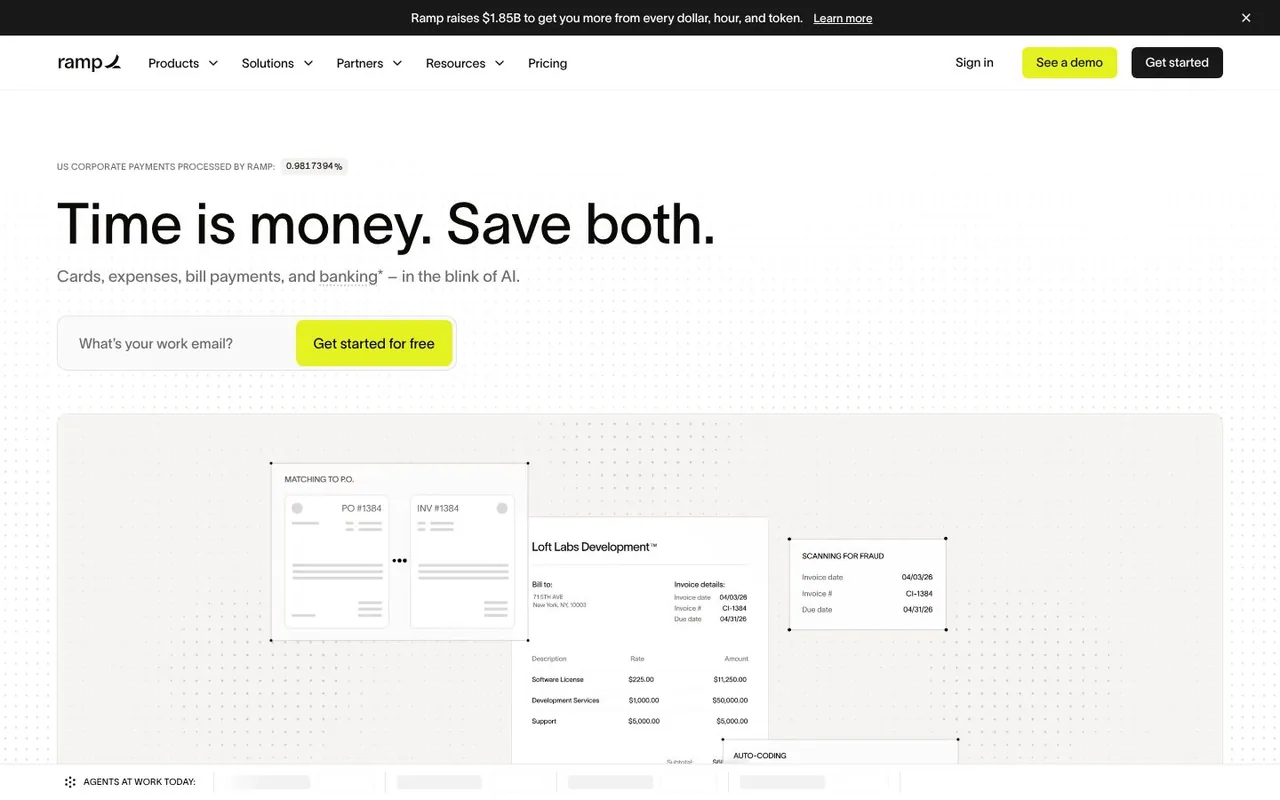
Ramp sells corporate cards and spend management, and opens with five words: "Time is money. Save both." Under them sit one email field, one yellow button and the product at work. What works: the headline is the whole pitch, and the only thing to do on the first screen is type your email.
2. Vercel
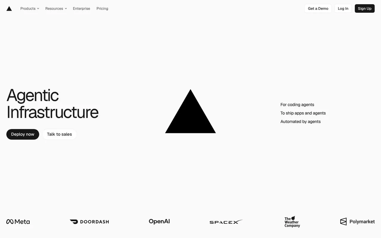
Vercel is a cloud platform for web apps, and its headline is two words: "Agentic Infrastructure". The triangle logo sits in the centre, with two buttons and a row of customer logos that includes OpenAI, Meta and DoorDash. What works: when the name is already known, the first screen can carry one idea and some proof, and nothing else.
3. Resend
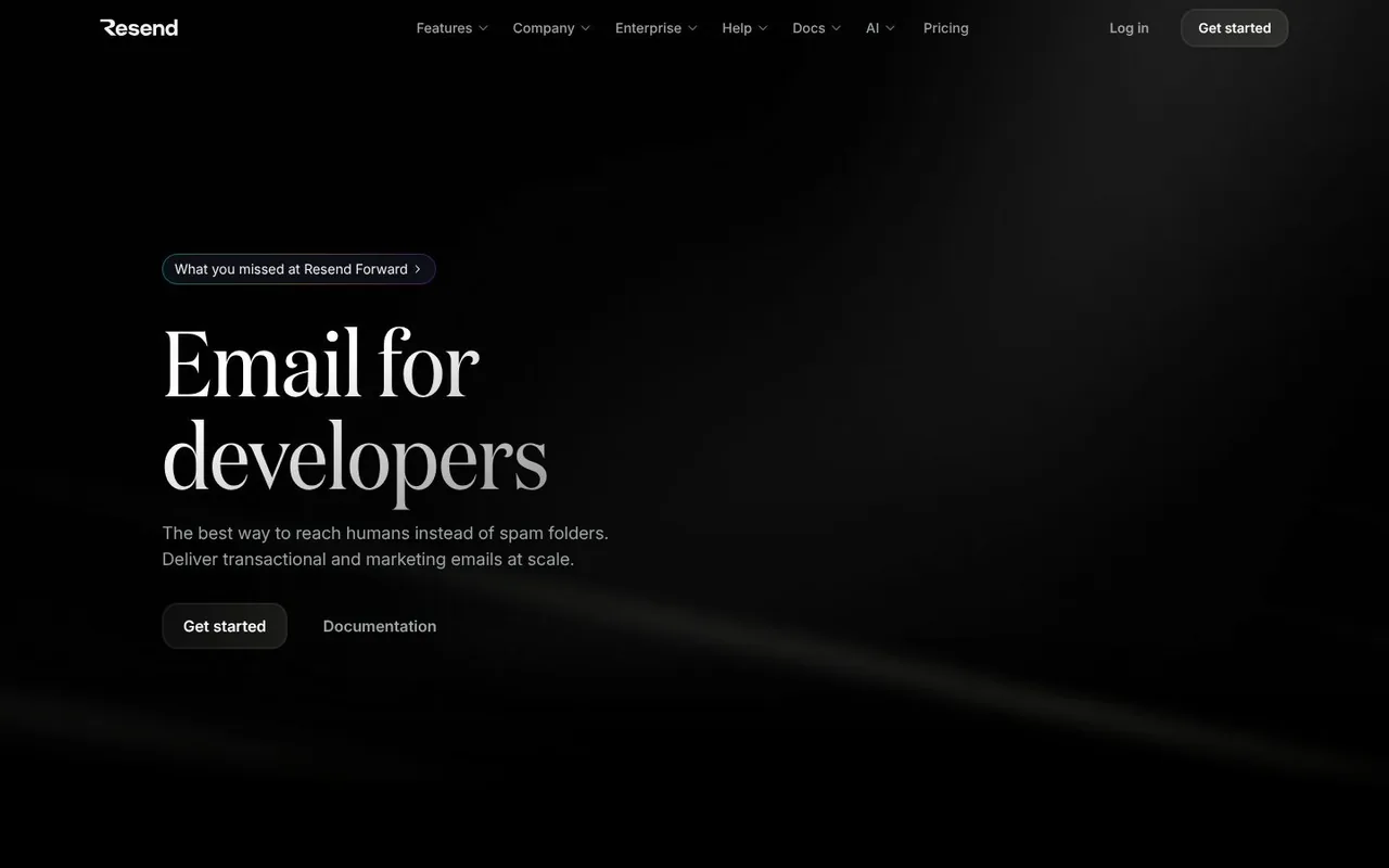
Resend is an email platform, and says who it is for in three words: "Email for developers", set in a serif on black. The two buttons are "Get started" and "Documentation". What works: it names the buyer in the headline and gives developers the link they want most, the docs.
4. Loom
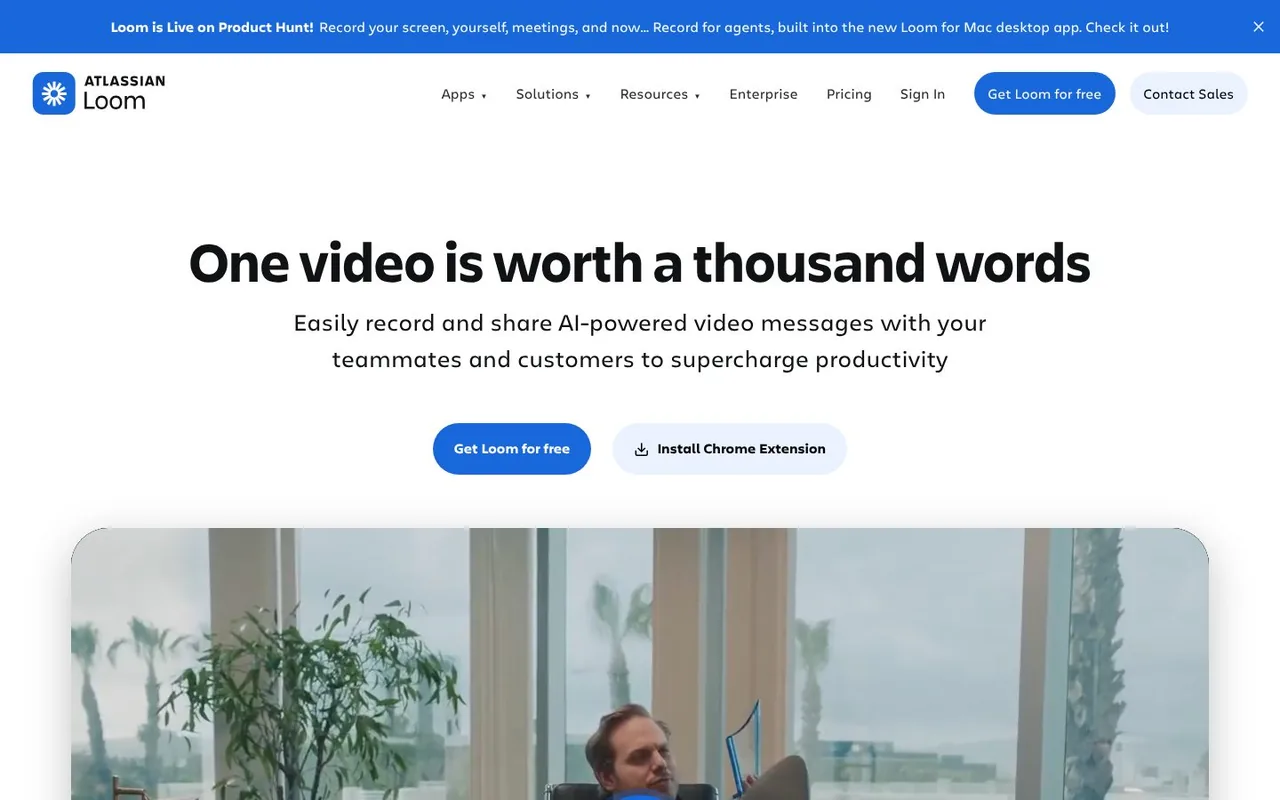
Loom is the screen recorder from Atlassian. It leads with "One video is worth a thousand words" and a video right under the buttons. What works: the headline argues for the product, and the page then proves the point in the product's own format.
5. Tally
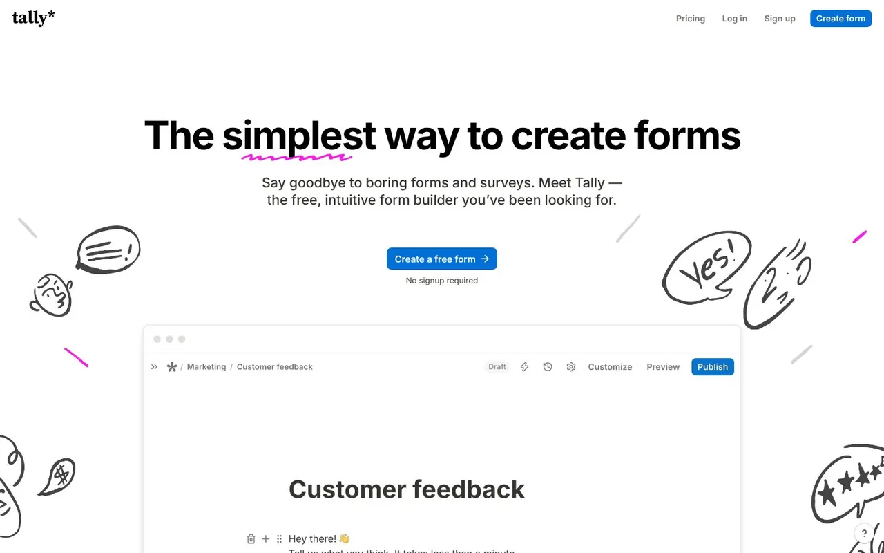
Tally is a form builder. "The simplest way to create forms" sits between hand-drawn doodles, with one blue button and "No signup required" under it. What works: the drawings give a simple product a personality, and the small line under the button removes the last reason not to click.
6. Railway
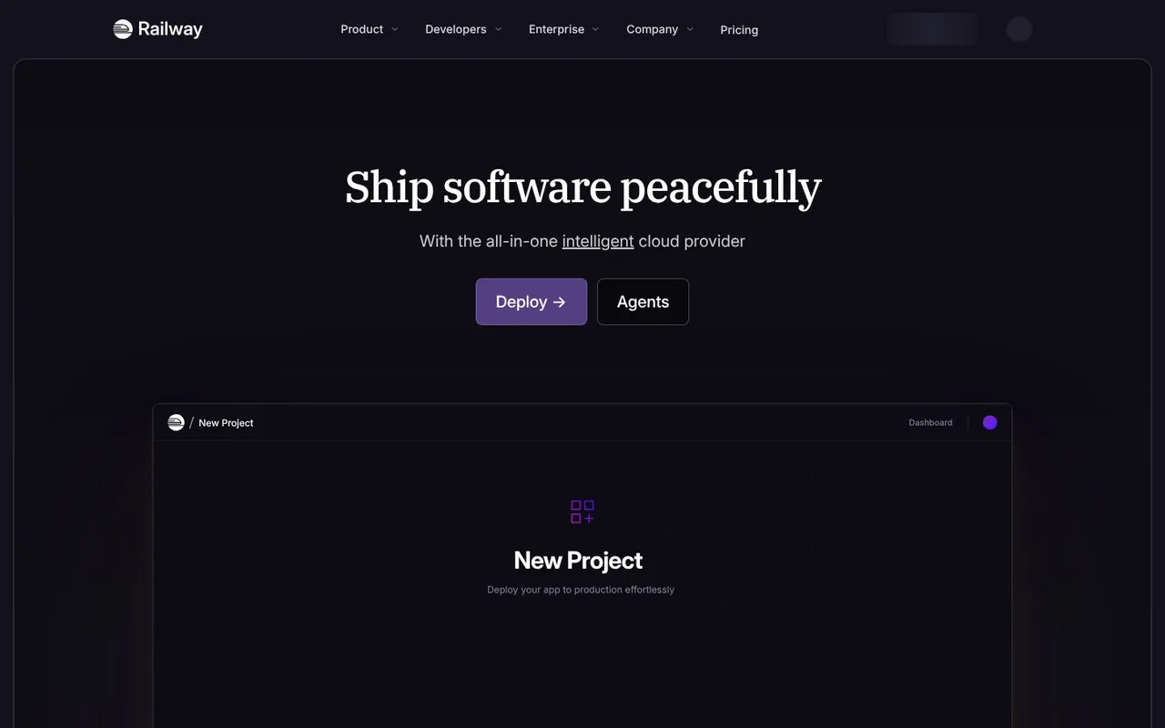
Railway is a cloud platform for deploying software. "Ship software peacefully" is set in a serif on deep purple, above the product's own "New Project" screen. What works: one unexpected word, peacefully, tells an engineer how the product feels to use.
7. incident.io
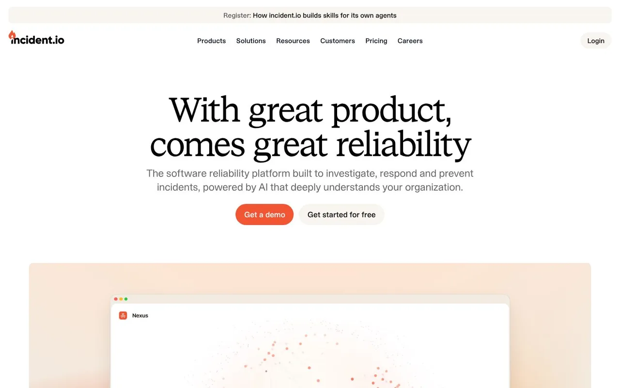
incident.io is a reliability platform for investigating and responding to incidents. The headline, "With great product, comes great reliability", is a serif on white, with a demo button and a free start side by side. What works: a familiar phrase bent to fit the product is easy to remember, and both ways to buy are open from the first screen.
Show the product
8. Notion
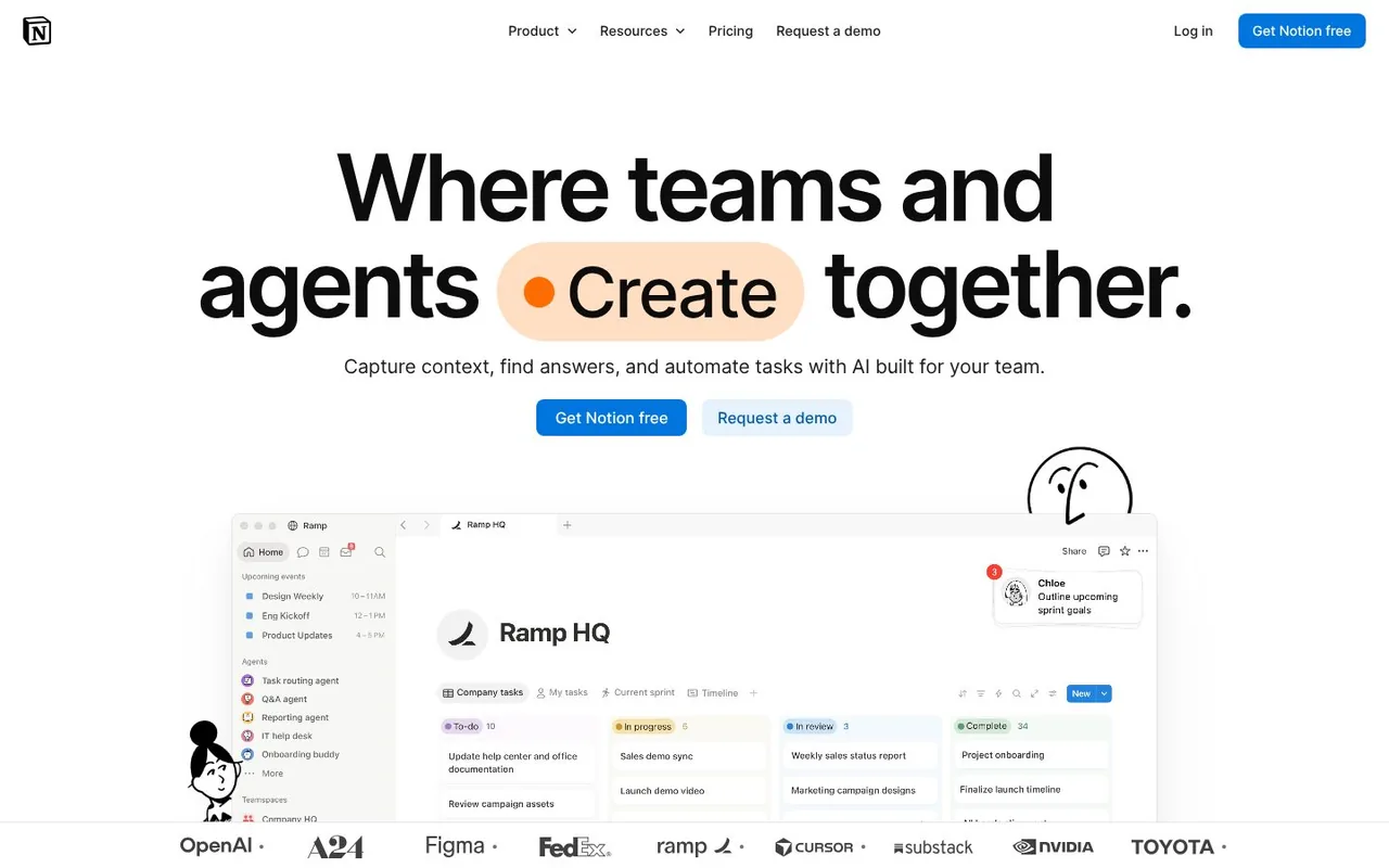
Notion sets one word of its headline, "Where teams and agents create together", in an animated pill, and the workspace itself fills the rest of the screen. Hand-drawn characters lean on the product shot. What works: you see the real interface before you scroll, and the drawings stop it feeling like a plain screenshot.
9. Slack
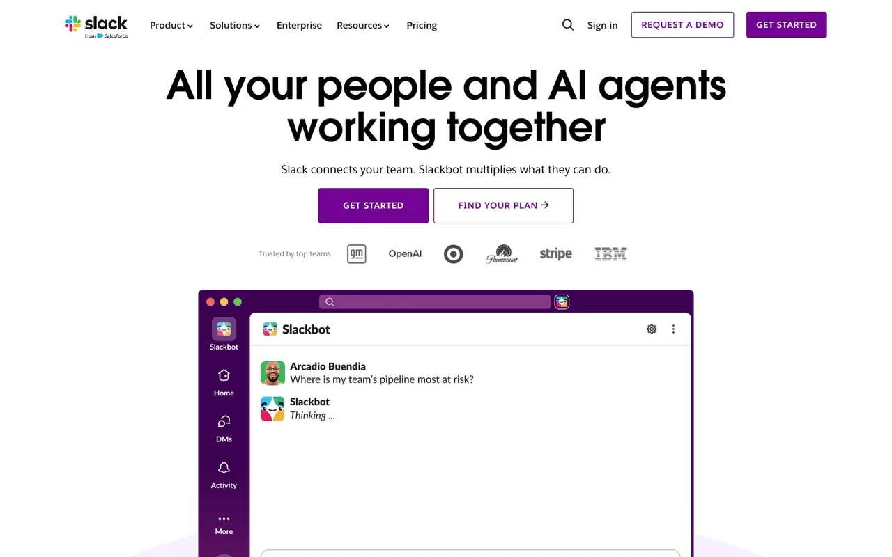
Slack opens with "All your people and AI agents working together" and, directly below, a Slack window where someone asks Slackbot where the team's pipeline is most at risk. What works: the new AI feature is shown inside the product people already know, not explained in a paragraph.
10. Supabase
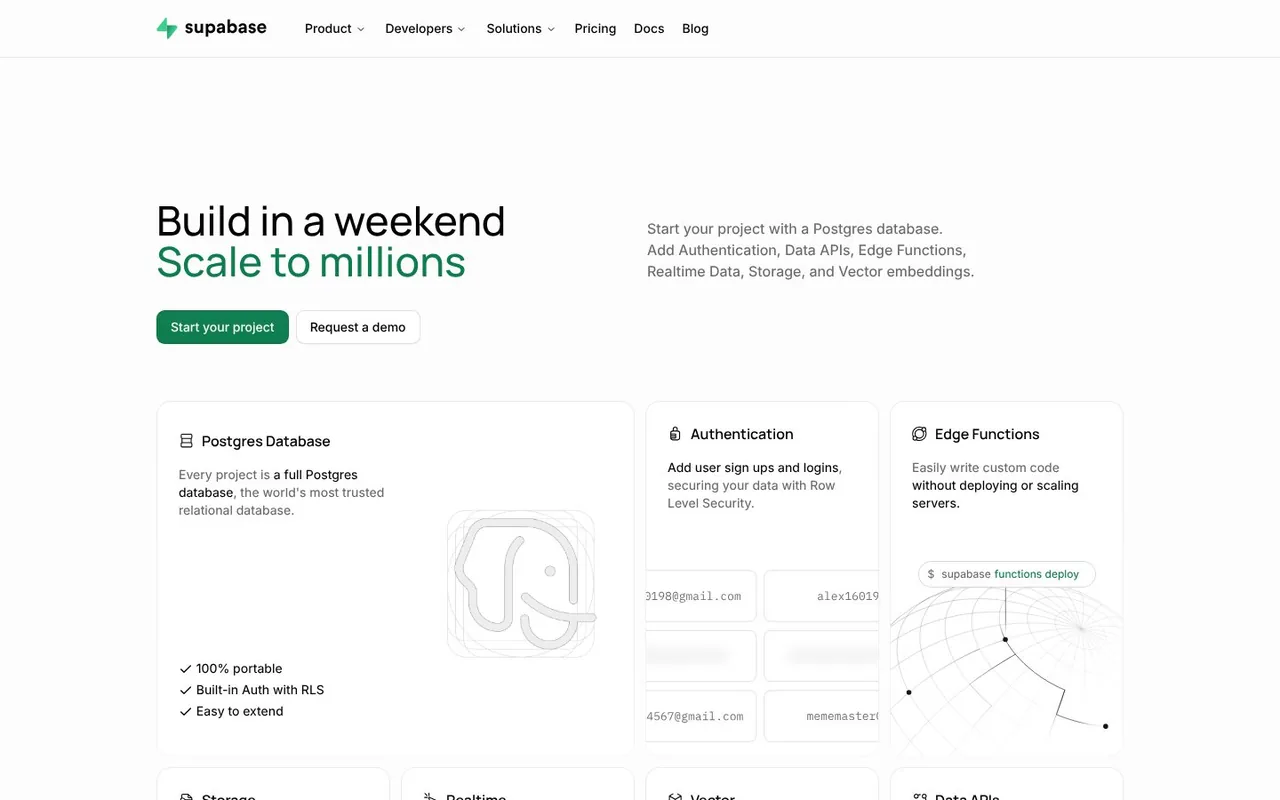
Supabase is a Postgres development platform. "Build in a weekend, scale to millions" has its second line in green, and under it is a grid of product cards: database, authentication, edge functions. What works: a developer can see what comes in the box without leaving the first screen.
11. PostHog
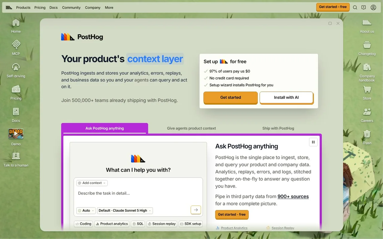
PostHog has built its homepage like a desktop operating system, with icons down the sides and the pitch inside a window. The window says "Your product's context layer" and the sign-up card adds "97% of users pay us $0". What works: the site is as opinionated as the product, and the pricing worry is answered right next to the button.
12. Cal.com
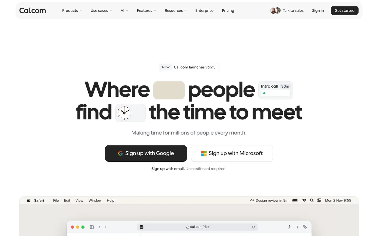
Cal.com is scheduling software. Its headline, "Where people find the time to meet", has pieces of the product set inside the sentence: a clock and an "Intro call 30m" chip. What works: the interface becomes part of the typography, so the headline and the demo are one thing.
13. Gusto
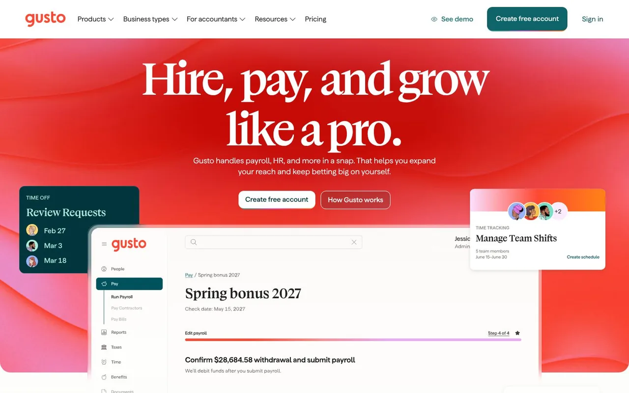
Gusto sells payroll and HR software. A warm red hero, a serif headline, "Hire, pay, and grow like a pro.", and a payroll run on screen. What works: colour and type make payroll feel friendly, and the product shot shows the moment a customer cares about most: running payroll.
The prompt box is the hero
A newer pattern in 2026: the first thing on the page is a text box, so you start describing what you want before you read about the product.
14. Retool
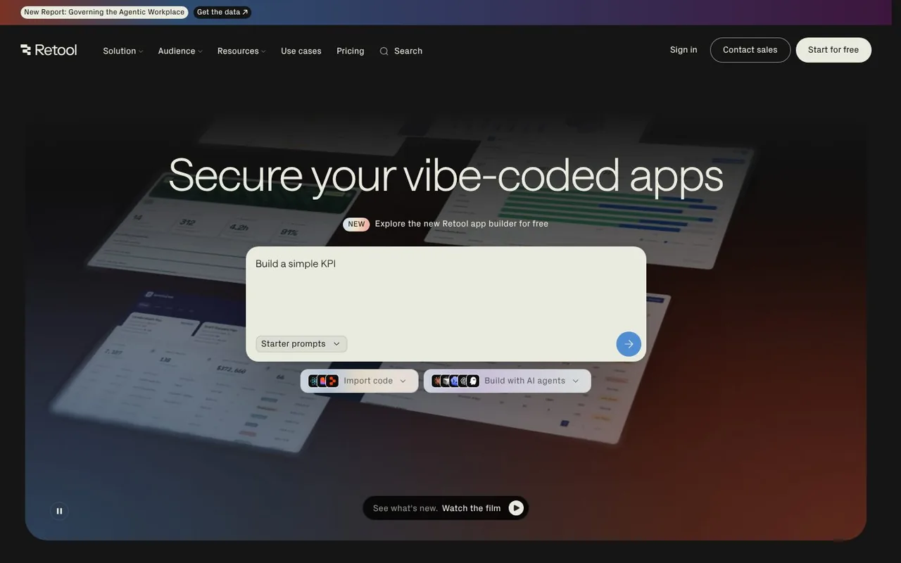
Retool builds internal software. Under "Secure your vibe-coded apps" is a prompt box with "Build a simple KPI" in it, plus options to import code or build with AI agents. What works: the first screen starts the job. You describe the app you want before you read a feature list.
15. Replit
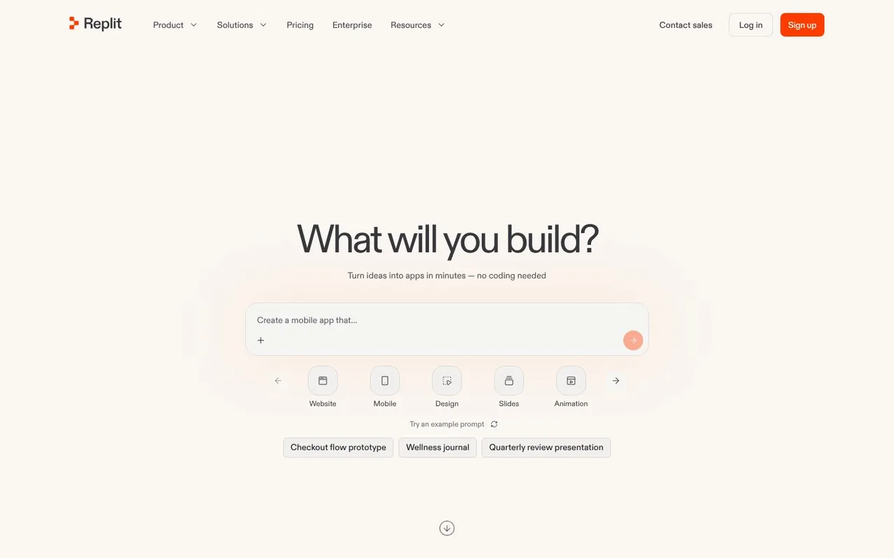
Replit asks "What will you build?" Four words, a prompt box and a row of starting points: website, mobile, design, slides, animation. What works: the question puts the visitor's idea first, and the row of options shows the range without a feature list.
16. Framer
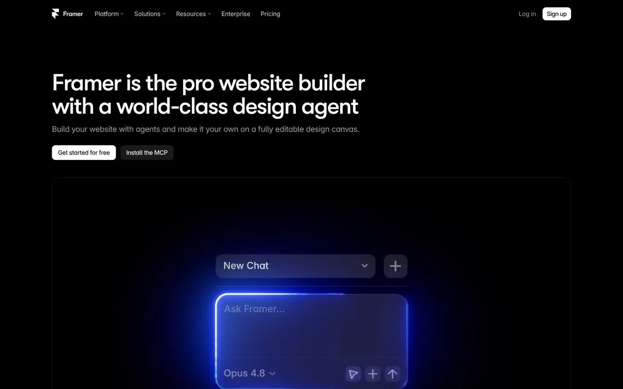
Framer is one of the two platforms we build on. It shows a glowing chat box on black under "Framer is the pro website builder with a world-class design agent". What works: black, one accent colour and one object. The page lets the new feature carry the whole first screen.
A world of its own
17. Clay.com
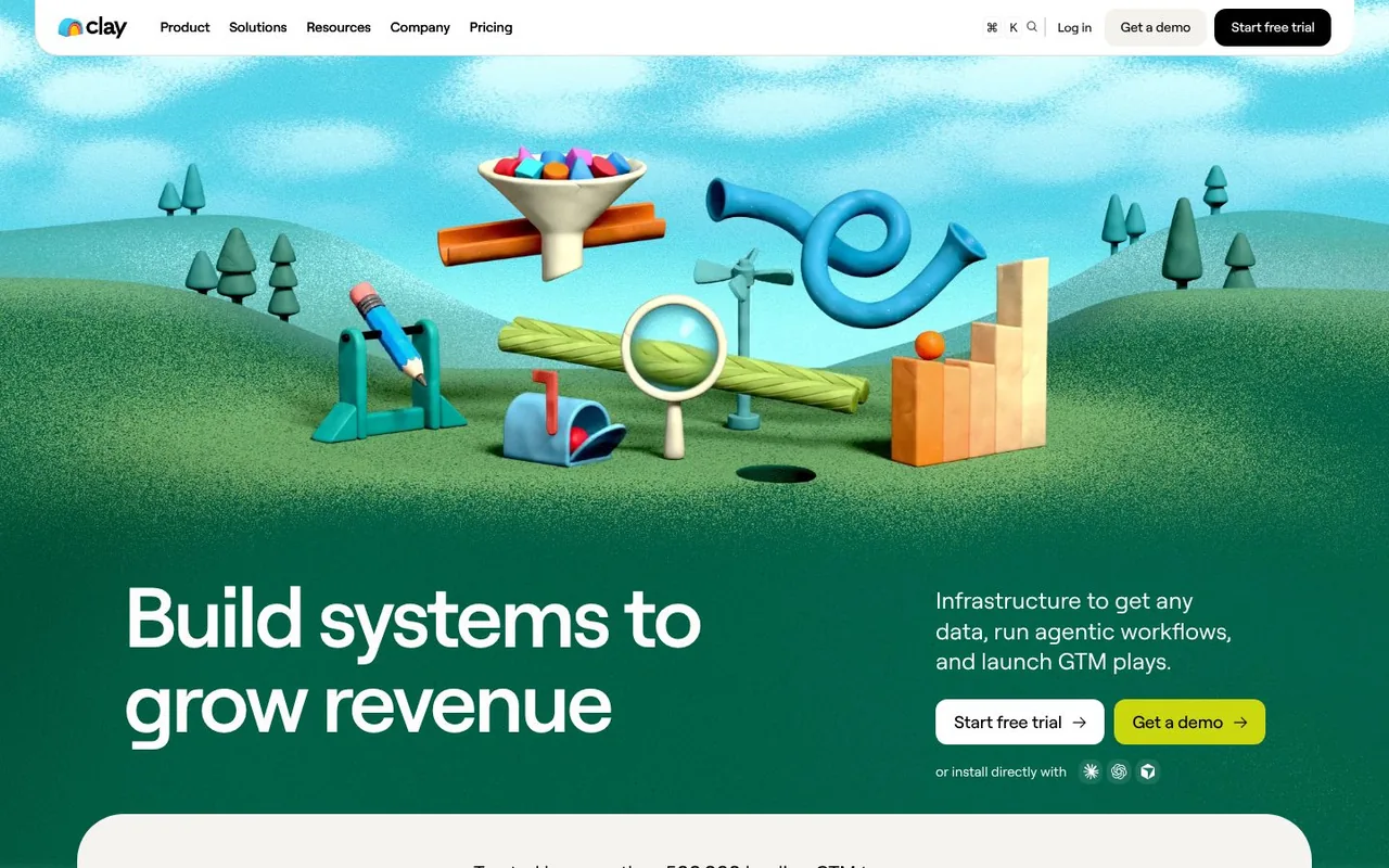
Clay fills its hero with a clay landscape: green hills, a funnel, a mailbox and a magnifying glass, all modelled in 3D. "Build systems to grow revenue" sits at the bottom left. What works: the brand name becomes the art direction, and nothing else in sales software looks like it.
18. Mercury
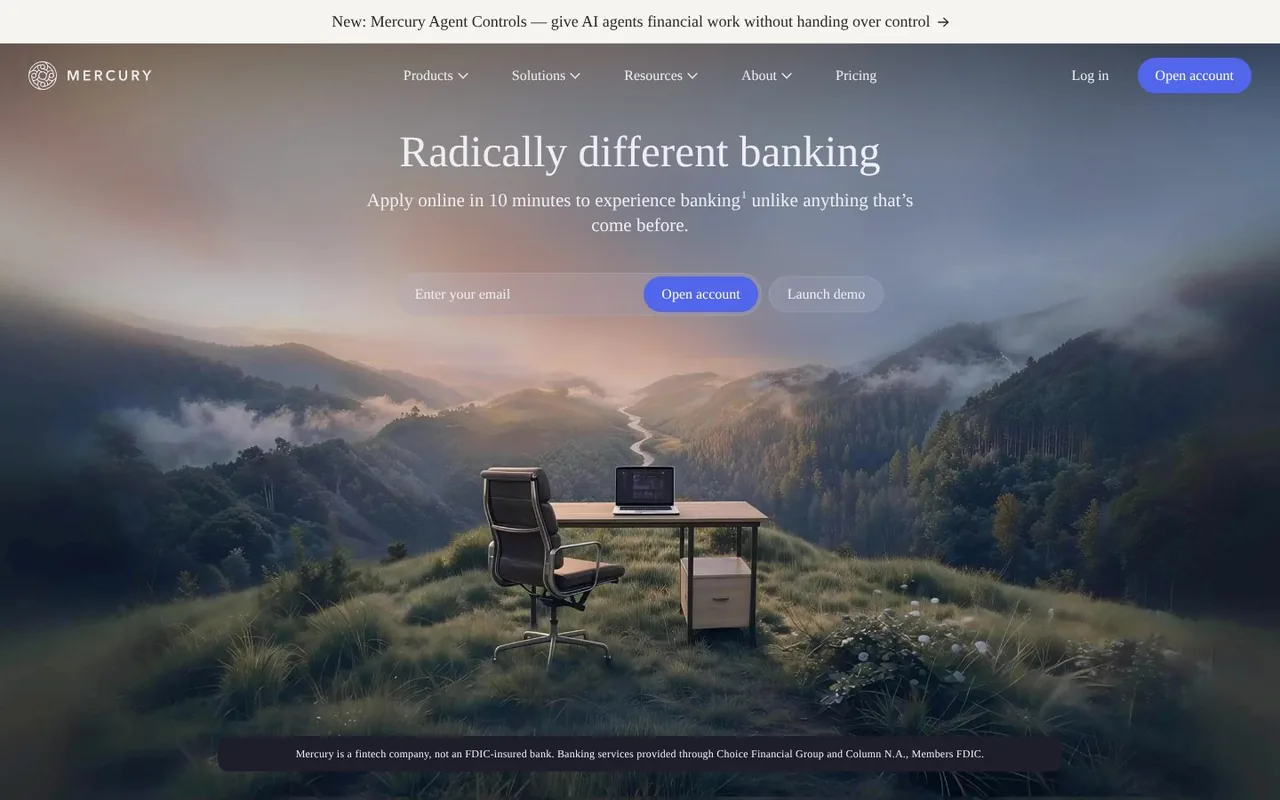
Mercury is a fintech company that offers business banking. "Radically different banking" is set in a serif over a painted mountain valley, with a desk and chair on the hillside. What works: calm, rich imagery signals trust in a category where trust is the product, and the email field sits right in the scene.
19. Stripe
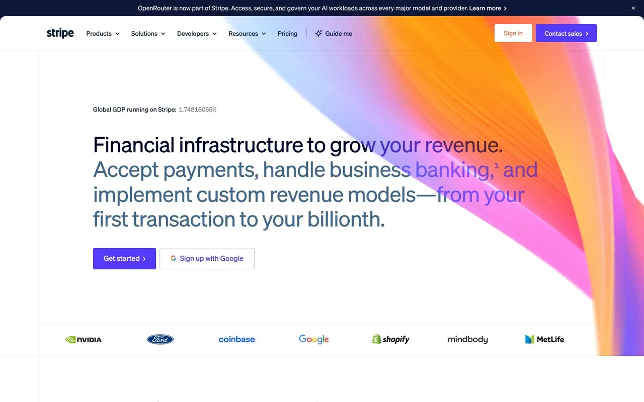
Stripe runs a ribbon of colour through the hero and prints a running figure above the headline: "Global GDP running on Stripe". Customer logos from NVIDIA to Shopify line the bottom. What works: the colour is unmistakably Stripe, and the figure is proof that updates itself.
20. Figma
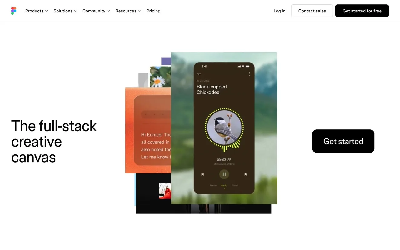
Figma puts "The full-stack creative canvas" on the left, a stack of designs in the middle and one large "Get started" button on the right. What works: the layout reads like a sentence: claim, proof, action. The button is impossible to miss.
21. Brex
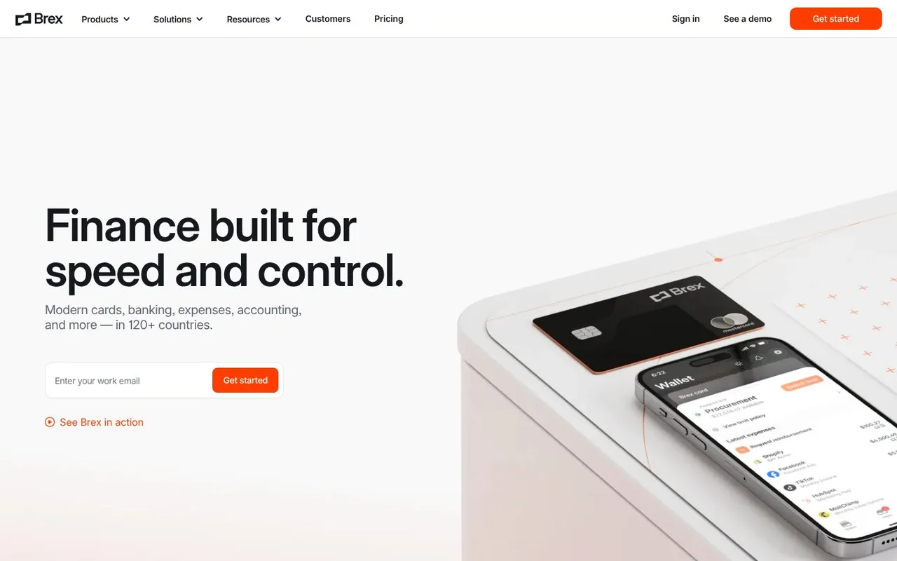
Brex sells corporate cards and finance software. "Finance built for speed and control." sits beside a 3D render of the card and the mobile app. What works: a physical object makes finance software feel tangible, and the line under the headline gets the reach in early: 120+ countries.
22. beehiiv
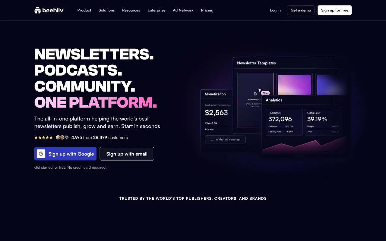
beehiiv is a newsletter platform. The headline is four stacked lines in capitals, "Newsletters. Podcasts. Community. One platform.", with the last one in pink and a rating right under it: 4.9/5 from 28,479 customers. What works: the type has the energy of the creators it sells to, and the proof is a precise number.
Our work: SaaS websites we designed
Three from our own studio, so you can see how we apply the same ideas.
23. Adopt AI (our work)
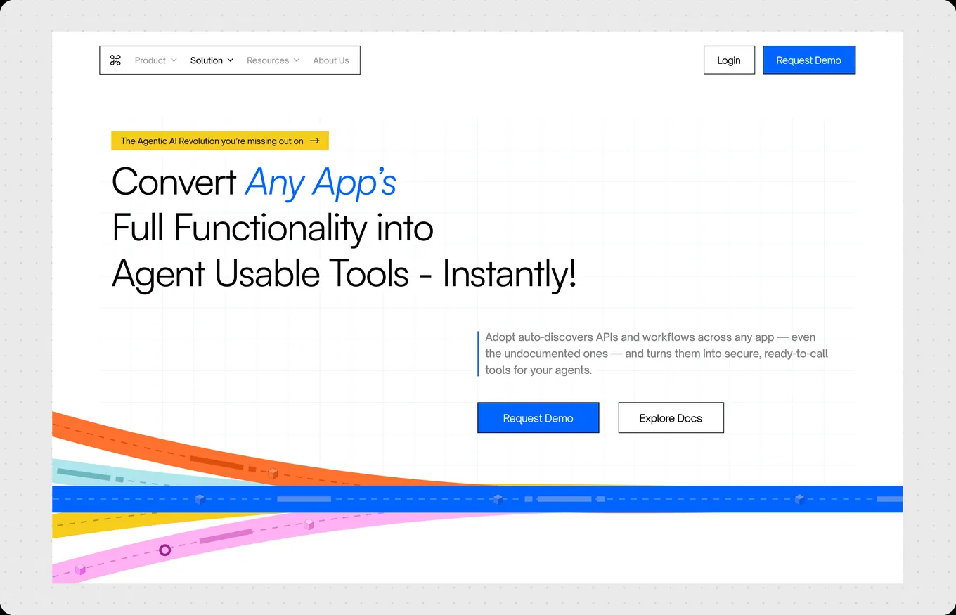
Adopt AI turns existing B2B and SaaS apps agentic through natural language. We did the brand, website, Webflow build and product launch video for its $6M seed, and the site was featured on the Webflow Blog. Read the Adopt AI case study.
24. Zime (our work)
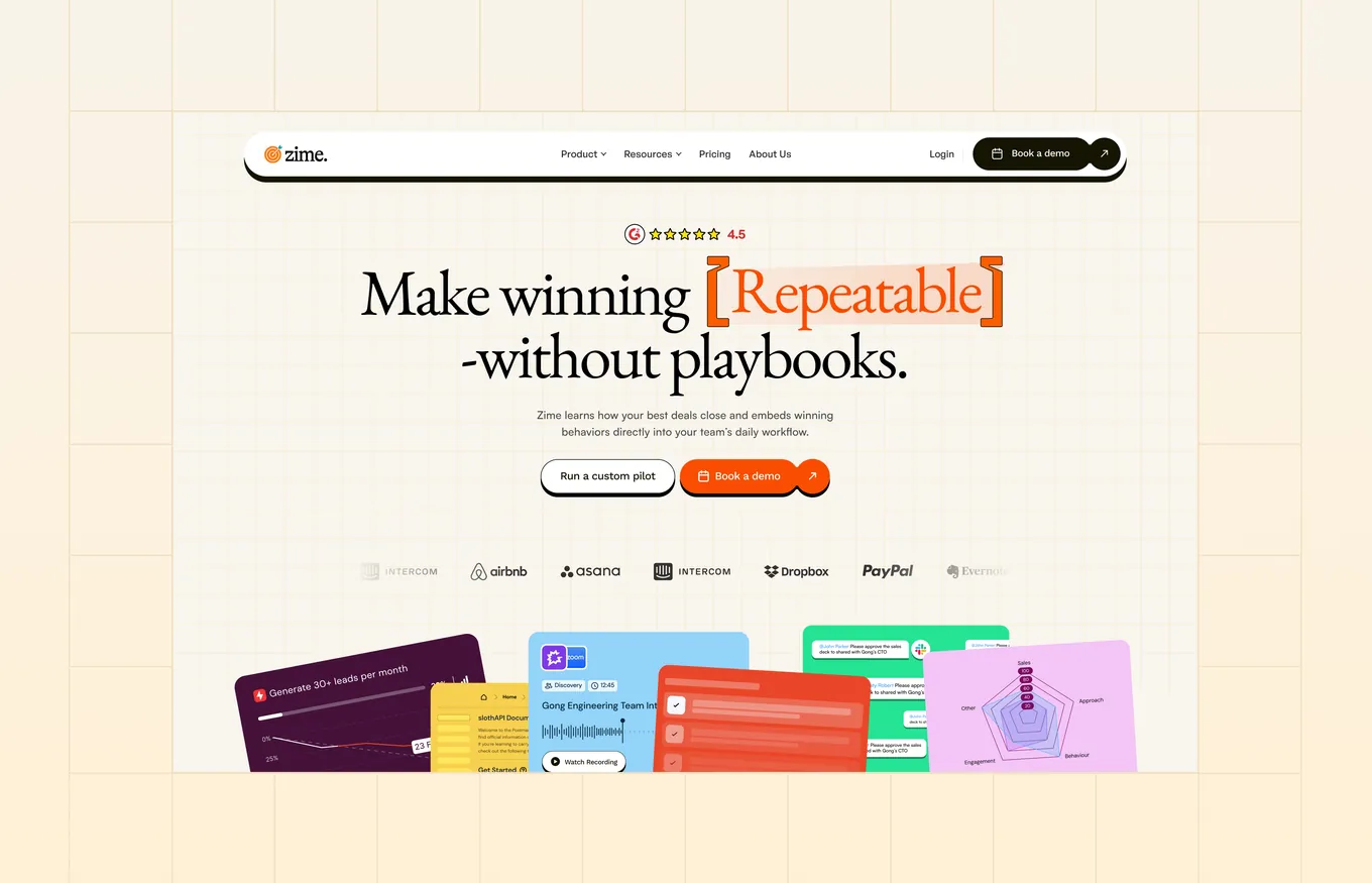
Zime is an AI-first sales enablement platform backed by Z21 Ventures. We designed the website and motion and built it in Webflow. Read the Zime case study.
25. Itilite (our work)
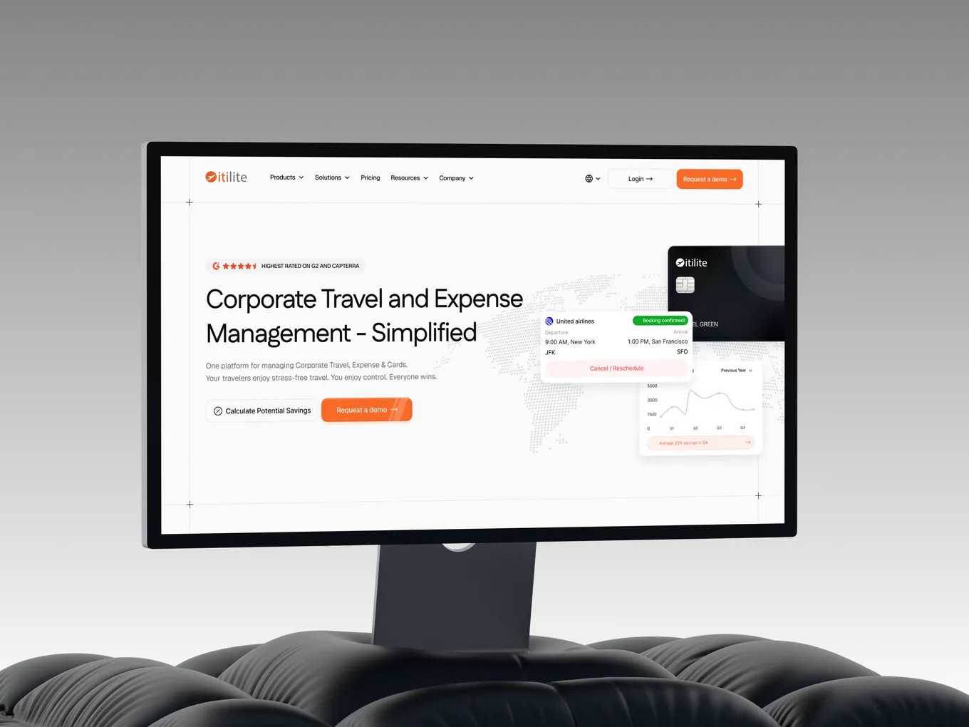
Itilite is a corporate travel and expense platform backed by Tiger Global. We redesigned the website and rebuilt it in Webflow with custom motion. Read the Itilite case study.
What the best SaaS websites have in common
- A short promise. "Time is money. Save both." "Email for developers." "Ship software peacefully." None needs a second read.
- The real product on the first screen. Notion, Slack, Supabase and Gusto show the interface itself, not an abstract picture of it.
- Two ways forward. Most pair a free start with a demo or sales button, so a founder and an enterprise buyer both have a next step.
- Proof early. Customer logos, a rating or a running number sit on the first screen of most of these pages.
- The newest feature up front. In 2026 that is usually AI. The strongest pages show it working inside the product, as Slack and Retool do.
- A look of its own. Clay, Mercury, PostHog and Stripe could not be mistaken for each other with the logos removed.
A checklist for your own SaaS website
- Can you say what the product does in six or seven words?
- Is the real interface visible without scrolling?
- Is there a free start, a demo button or both, and do they match how you sell?
- Is your strongest proof on the first screen?
- If you have shipped an AI feature, does the homepage show it in use?
- Would the page still be recognisable with the logo removed?
- Can your marketing team edit the site without a developer?
Related reading: SaaS Website Design: 12 Best Practices With Real Examples · Best SaaS Website Design Agencies for Startups · 23 Startup Website Examples · 25 AI Website Examples Worth Studying
FAQ
What makes a good SaaS website?
A short headline that says what the product does and who it is for, the real product on the first screen, proof such as customer logos or a rating, and a clear next step. The best ones also have a visual identity that could not belong to anyone else.
What should a SaaS homepage include?
A headline and one supporting line, a product visual, one or two calls to action, customer proof, a short tour of the main features or use cases, and a closing call to action. Pricing, security and integrations usually get their own pages.
How long should a SaaS homepage be?
Longer than a young startup's. The median across the 57 SaaS homepages we loaded was about 11 screens at desktop size, against seven for the YC startups in our earlier study. Established products have more features, buyers and proof to cover.
Should a SaaS website offer a demo or a free trial?
Match the button to how you sell. Of the 57 homepages we checked, 32 showed both a sales route and a free start on the first screen. Self-serve products lead with the free start, and products sold to larger teams lead with the demo.
What should a SaaS website be built on?
It depends on who will edit it. Webflow and Framer let a marketing team publish pages without developers. A custom build in a framework such as Next.js gives engineers full control, but every change needs their time. We build in Webflow and Framer.
How long does it take to design and build a SaaS website?
Most of our websites take 2 to 6 weeks, depending on the number of pages and how ready the content is.
Which SaaS websites has Studio Huncho designed?
Sprinto, Refold AI, SimpliSmart, Adopt AI, Zime, Itilite, Coris and Further AI, among others. Most were designed and built by the same team in Webflow or Framer.
Planning a new SaaS website before a raise or a launch? Send us your launch date and we'll tell you what we can ship by then. You can also see how we approach SaaS website design.
Work with Studio Huncho
We're a creative studio for AI and SaaS startups. We design brands, websites, products and launch films, and build sites in Webflow and Framer.