4 min readMINUTES
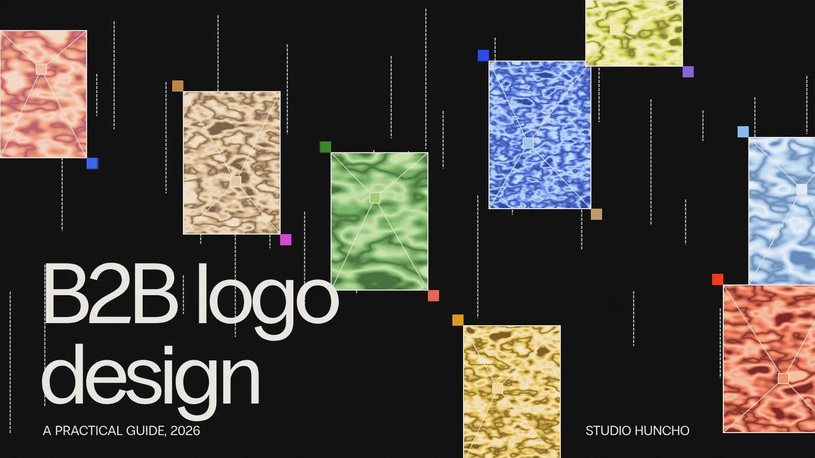
B2B Logo Design: A Practical Guide (2026)

The short answer
A B2B logo spends most of its life small: in a browser tab, an app header, the corner of a slide and a row of partner logos on someone else's website. So it has to be legible at 16 pixels, work in a single colour and stay distinct next to other logos. In B2B, a logo that looks trustworthy for ten years is worth more than one that looks new for one.
What makes B2B logo design different
- Where it appears. Product UI, sales decks, contracts, integrations pages and other companies' logo bars, more than billboards or packaging.
- Who sees it. Buyers who are assessing risk. They are asking whether this company will still be here in three years.
- How long it lasts. B2B relationships run for years, and a logo that changes often looks unstable.
- What sits beside it. Your customers' and partners' logos. It has to hold its own in that row.
The main types of B2B logo
- Wordmark. The company name in a distinctive typeface. Clear, and the safest choice for a new name people need to learn.
- Symbol and wordmark. A mark that can stand alone as an app icon or favicon, paired with the name. The most common choice for software companies.
- Lettermark. One or two letters. Useful for long names, harder to make distinctive.
- Dynamic logo. A mark that changes within rules, for example by product or in motion. See dynamic logos.
A six-point test for a B2B logo
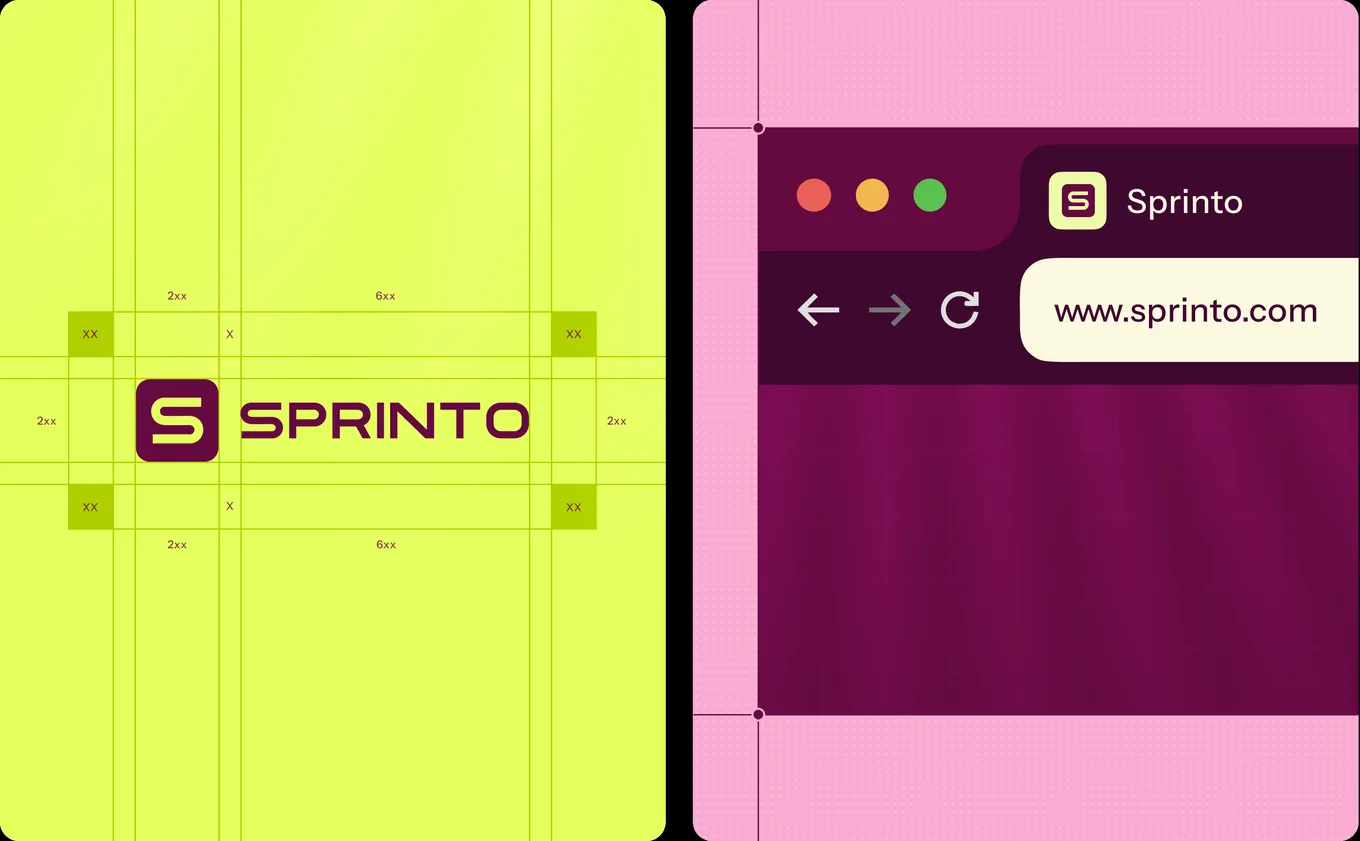
- 16 pixels. Is it recognisable as a favicon?
- One colour. Does it work in plain black and plain white?
- The logo bar. Placed in a row with ten other company logos, does it stand out without shouting?
- Dark and light. Does it sit well on both backgrounds?
- The name test. Can someone read the company name at a glance?
- Five years. Does it rely on an effect that will date?
The design process
- Discovery. What the company does, who buys, and which logos it will sit beside.
- Directions. Several distinct routes, shown in real contexts such as a product header, a deck and a logo bar, not on a blank page.
- Refinement. One route developed: spacing, weights, the symbol on its own.
- System. Colour, type and usage rules, so the logo is part of an identity. See logo or brand identity.
- Files and handover. Vectors, PNGs, light and dark versions, favicon and app icon. See what files you should get with a logo.
At Studio Huncho the logo is designed as part of the brand identity, which takes 4 to 6 weeks for most startups.
Examples from our work
- Sprinto. A brand identity and visual system for a compliance platform, including the framework badges redrawn as brand assets. See the Sprinto case study.
- Brand Factory by Dcluttr. A logo and full visual identity built to survive print and packaging as well as screens. See the Brand Factory case study.
- Sookti AI. An identity anchored by ASCII design elements, for a company selling AI to SAP teams. See the Sookti AI case study.
- Simplismart. A brand identity for a technical infrastructure audience. See the Simplismart case study.
Common mistakes
- The literal icon. Gears, clouds, shields and, for AI companies, sparkles. If a competitor could use the same symbol, it is not yours.
- Gradients that carry the design. If the logo fails in one colour, it will fail on an invoice, a partner page and a conference badge.
- Thin type. Hairline letters disappear at small sizes.
- Designing the logo alone. Without colour, type and layout rules, every page still looks different.
- Too many versions. One primary logo, one symbol, light and dark. More than that and nobody knows which to use.
When to redesign a B2B logo
- The company has a new name, or has merged.
- It is moving upmarket and the old mark looks like an early-stage product.
- The logo is unreadable at small sizes or breaks in one colour.
- The product has changed and the symbol describes the old one.
If the logo still passes the six-point test, a refresh of the identity around it is often enough. See brand refresh or rebrand and how to rebrand without losing recognition.
How we can help
Studio Huncho is a creative studio in Bangalore that designs logos and brand identities for funded B2B and AI companies, from seed stage to IPO. See logo design, brand identity design and our B2B branding guide.
FAQ
What makes a good B2B logo?
It is legible at small sizes, works in one colour, stays distinct in a row of other logos and does not depend on a trend.
Should a B2B startup use a wordmark or a symbol?
Most software companies need both: a wordmark for recognition and a symbol for the app icon and favicon.
How long does B2B logo design take?
As part of a brand identity, four to six weeks for most startups.
Can we design the logo before the brand?
You can, but design at least the colours and typefaces with it, so the logo has a system to live in.
How often should a B2B company change its logo?
Rarely. Change it when the company changes, not when tastes do.
Need a logo or a full identity? Tell us where you are and we reply with a scoping doc and timeline within 48 hours.
Work with Studio Huncho
We're a creative studio for AI and SaaS startups. We design brands, websites, products and launch videos, and build sites in Webflow and Framer.